BRANDING | WEB DESIGN | ART DIRECTIONGIRLS WHO CODE
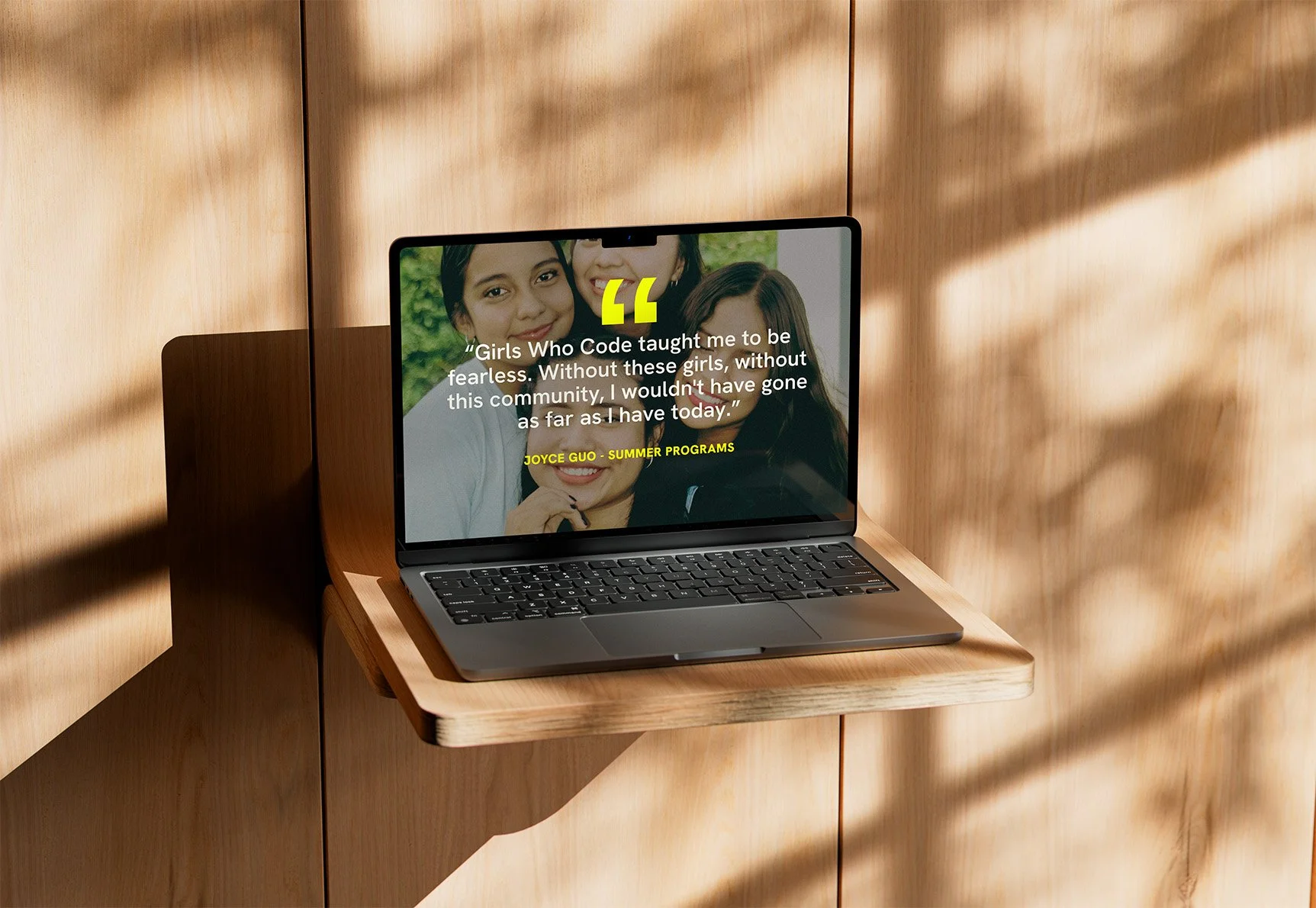
Girls Who Code are a global non-profit dedicated to closing the gender gap in technology. For this project, I rebranded the organisation and redesigned its website to create a bold, conversion-focused experience that inspires action.
By combining activist-inspired branding with modern UX principles, I developed a responsive digital platform that educates, engages, and encourages users to join the movement, support the mission, and help shape a more inclusive future in tech.
The Challenge
Despite the important work Girls Who Code carries out, many non-profit websites struggle to balance storytelling with conversion. Users often arrive with different intentions, whether they are looking to join a programme, support the organisation financially, learn more about its mission, or access resources.
The challenge was to create a clear user journey that educated visitors about the problem while guiding them towards meaningful action.
The redesign needed to:
Modernise the visual identity
Appeal to a younger audience
Increase engagement and programme sign-ups
Strengthen donation opportunities
Improve navigation and accessibility
Create a seamless experience across desktop and mobile devices
Brand Refresh
The visual identity was redesigned to position Girls Who Code as more than an educational organisation. The refreshed brand presents the organisation as a movement actively challenging gender inequality within the technology industry.
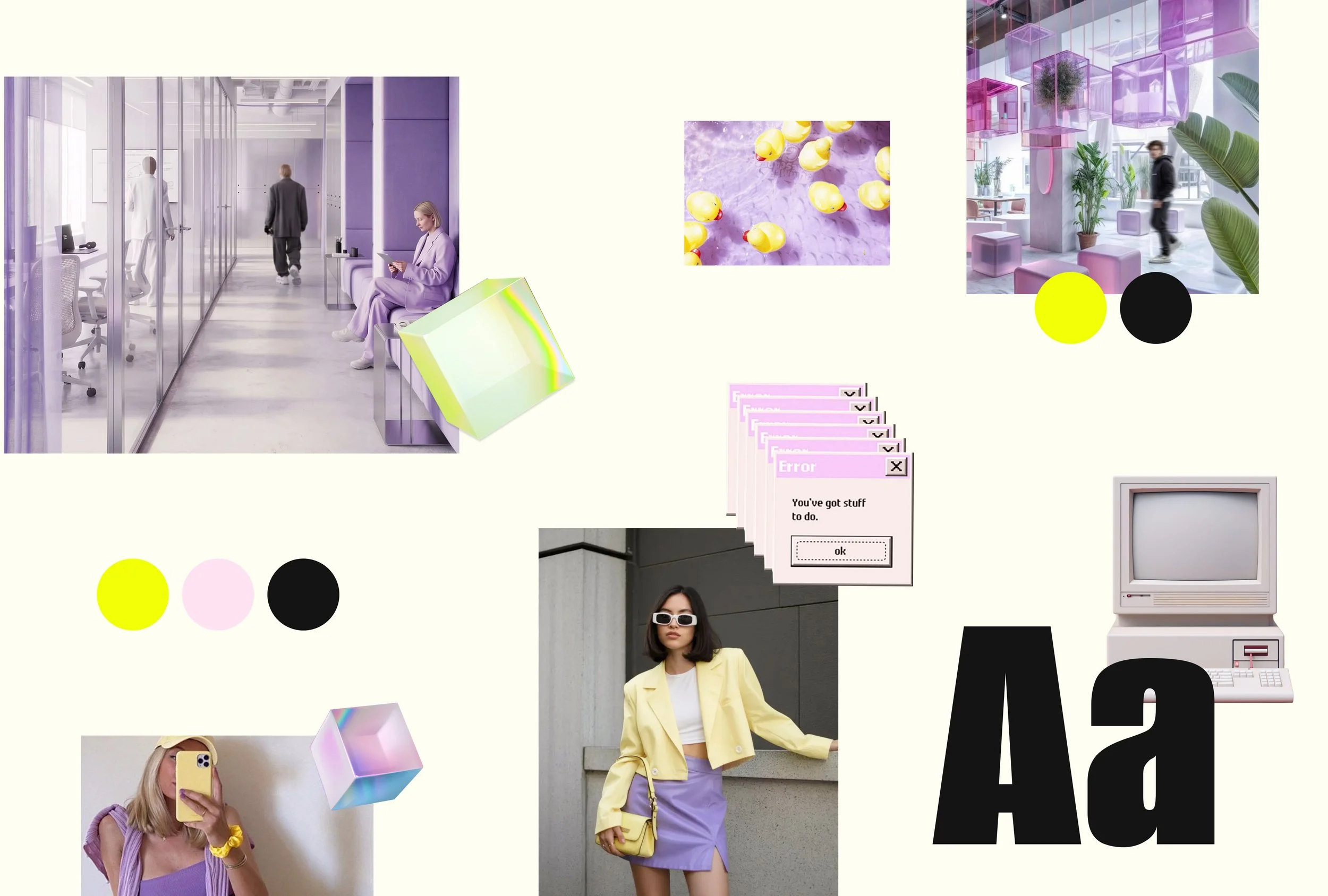
The creative direction was heavily influenced by themes of empowerment, activism, digital culture, and self-expression. The mood board combined contemporary design trends with technology-inspired visuals to create a brand that feels bold, optimistic, and future-focused.
Rather than relying on traditional corporate technology aesthetics, the new identity embraces vibrant colours, expressive typography, and playful digital elements that resonate with younger audiences.
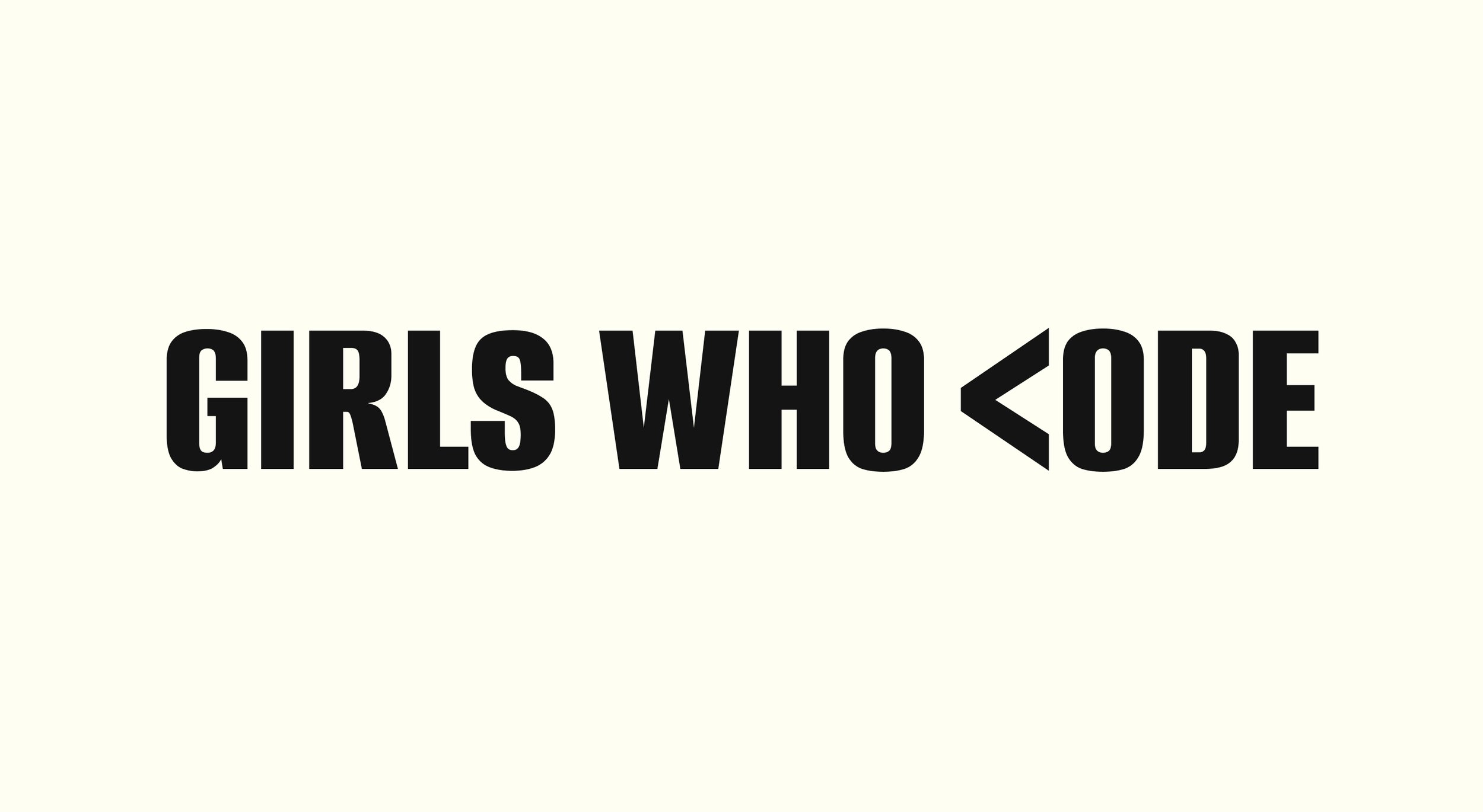
Logo Design
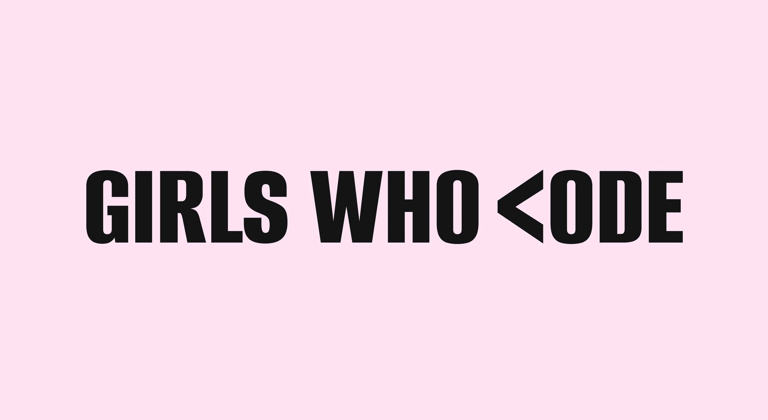
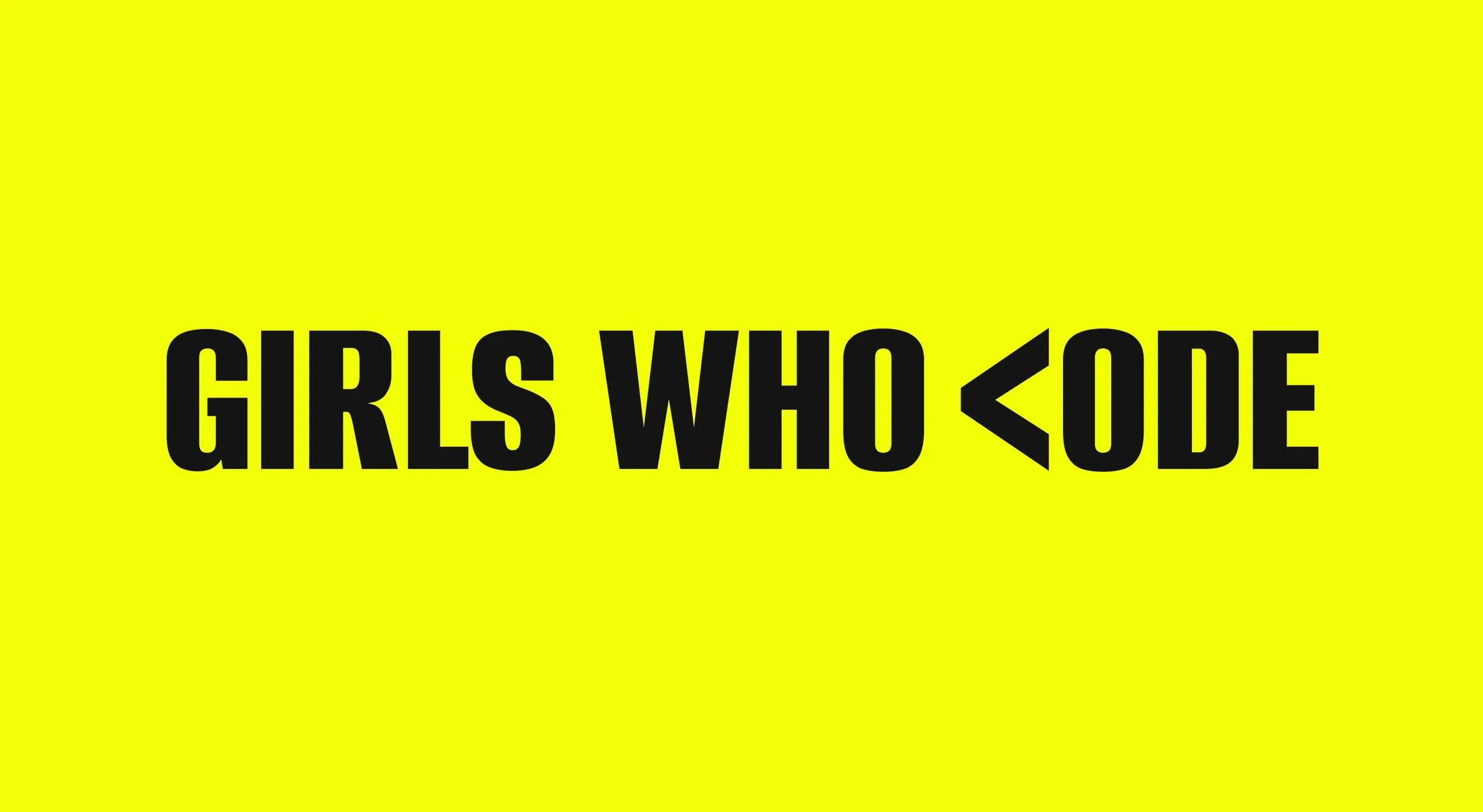
The logo was redesigned to create a stronger connection between the organisation's mission and the world of coding.
A coding bracket symbol was integrated directly into the wordmark, replacing the "C" in "Code". This subtle yet impactful change instantly communicates technology while creating a memorable and distinctive brand mark.
Colour Palette
Colour played a key role in creating an emotional connection with users.
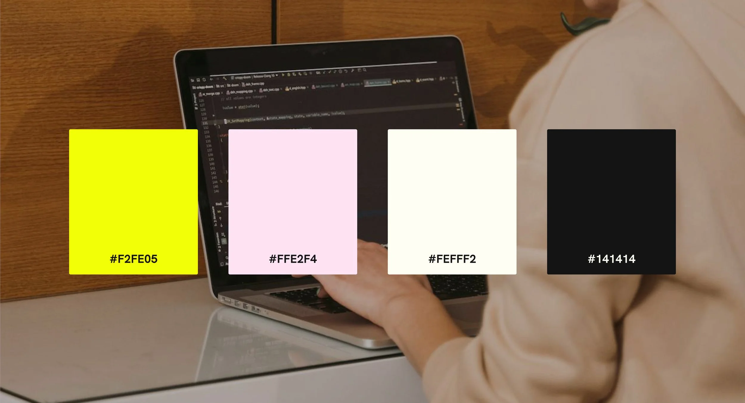
The palette combines:
Soft pink tones to create warmth and approachability
Neon yellow accents to capture attention and highlight calls-to-action
Black for contrast and readability
Neutral backgrounds to maintain balance throughout the interface
The combination creates a visual identity that feels energetic, optimistic, and modern while remaining highly accessible and conversion-focused.
The bright yellow accents were strategically used to draw attention to important actions such as programme sign-ups and donations, helping guide users through the experience.
Typography
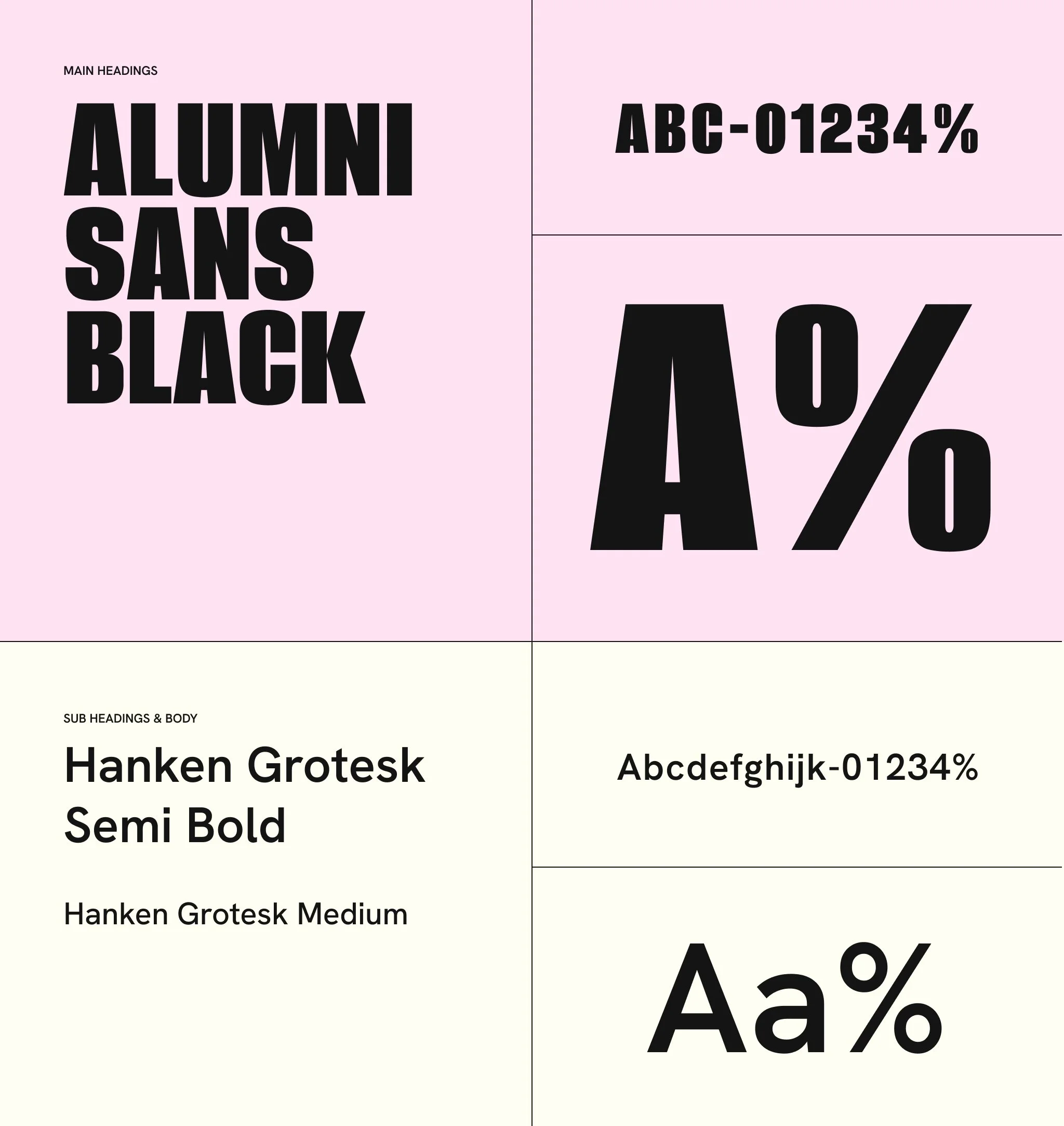
The typography system was designed to establish a clear visual hierarchy while reflecting the organisation's confident personality.
A bold condensed display typeface was used for headings to create impact and reinforce the campaign-like tone of the brand.
This was paired with a clean sans-serif font for body copy to ensure readability across all screen sizes and devices.
The contrast between the two typefaces creates a strong hierarchy that improves scanability and supports user engagement.
Brand Assets & Iconography
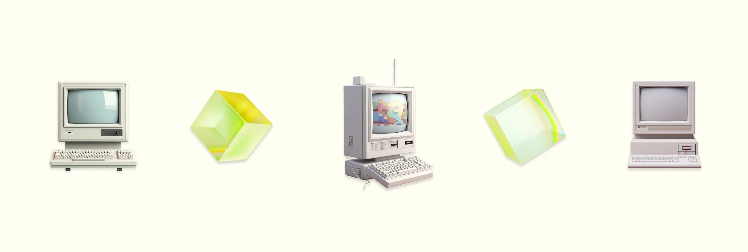
To strengthen the visual identity, a collection of custom brand assets was developed.
Translucent geometric graphics inspired by digital interfaces were used throughout the website to create consistency and visual interest. These elements help connect the brand to technology without relying on predictable coding imagery.
Retro computer-inspired visuals were also incorporated as a key brand asset. These graphics reinforce the theme of technology while creating a distinctive and memorable aesthetic.
Simple iconography was used throughout the interface to support navigation, improve comprehension, and enhance usability without overwhelming the user.

UX Strategy & User Journey
The website was designed around a conversion-focused user journey.
The homepage follows a clear narrative structure:
1. Awareness
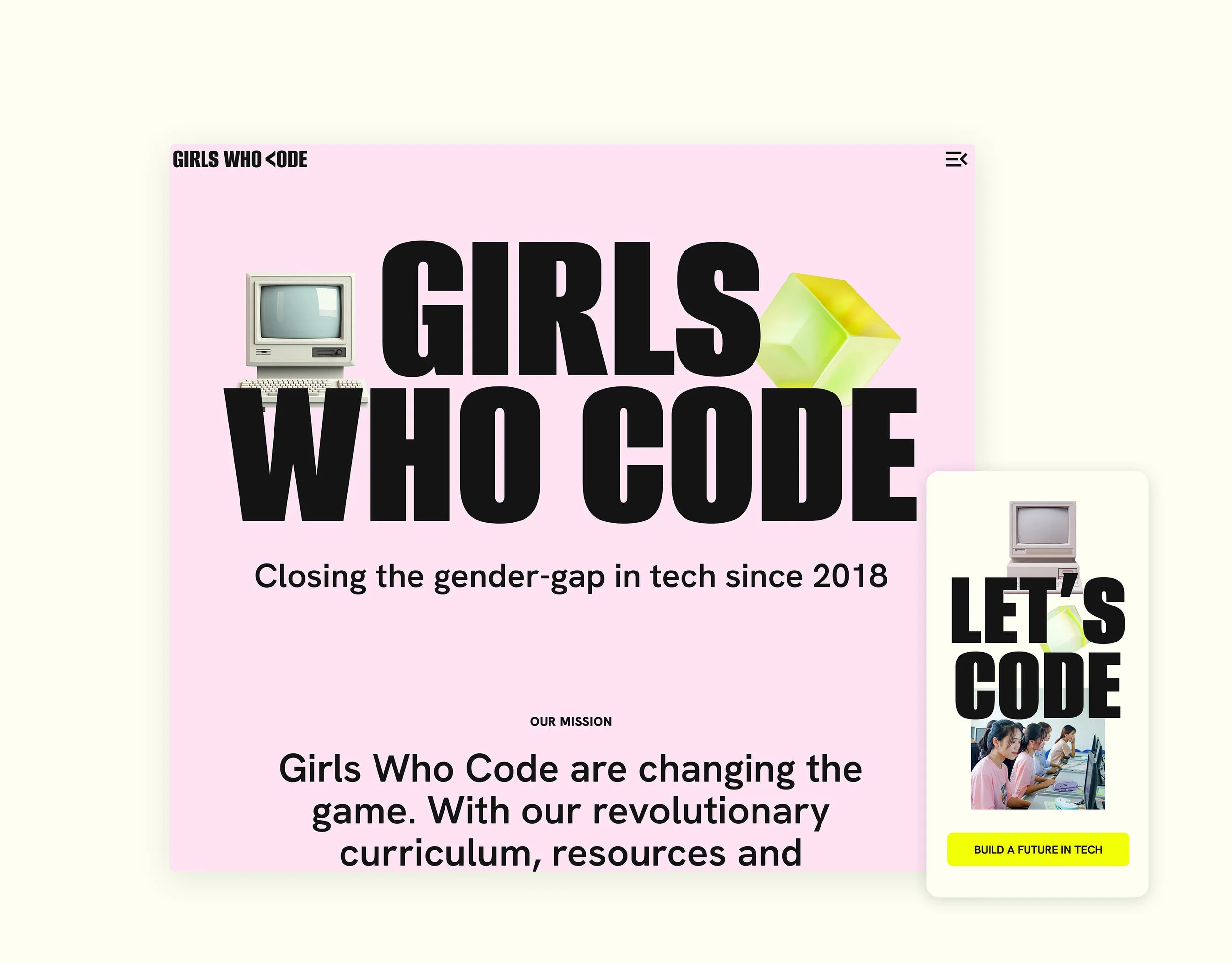
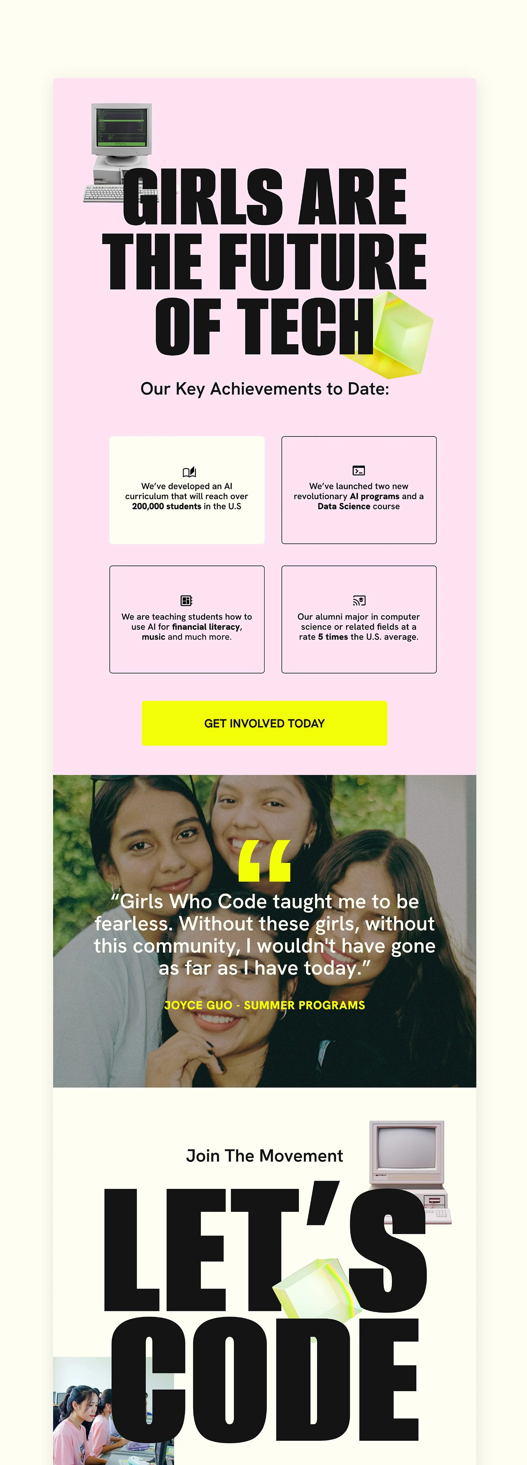
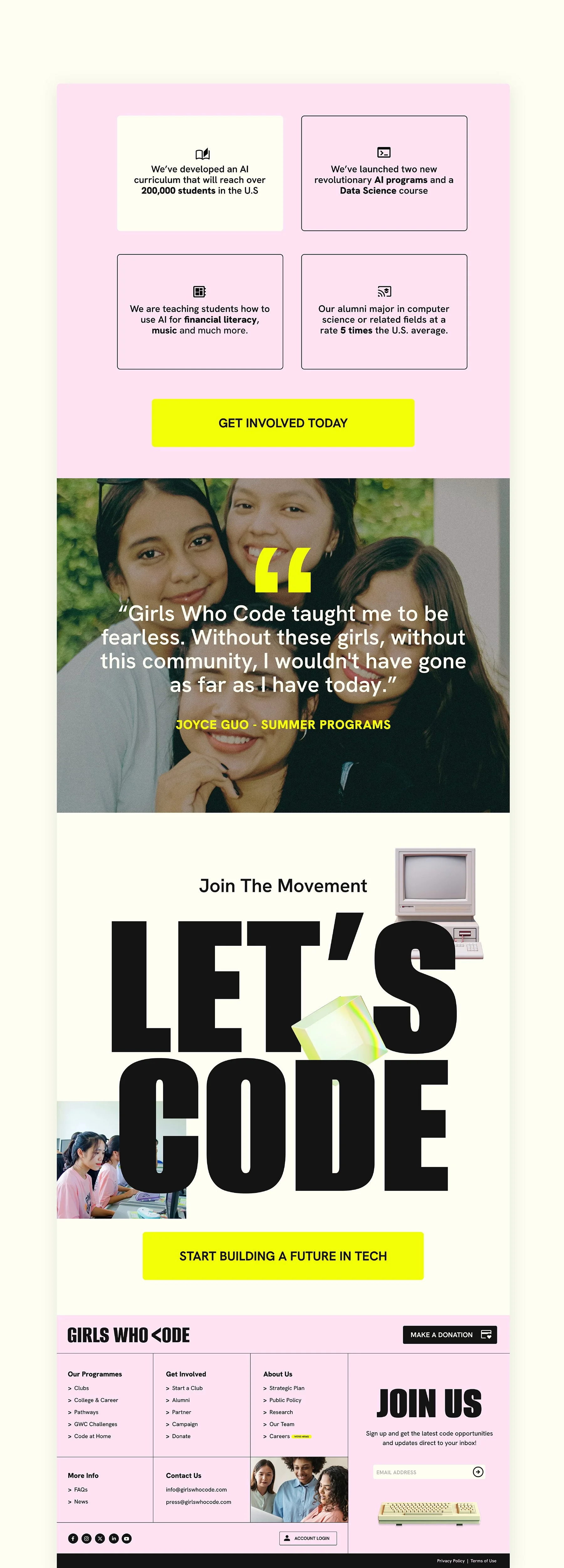
Users are immediately introduced to the mission through a bold hero section and empowering messaging.
2. Education
Statistics and supporting content highlight the ongoing gender gap within the technology industry, helping users understand the importance of the organisation's work.
3. Trust Building
Impact-driven content demonstrates how Girls Who Code is creating real change through its programmes and initiatives.
4. Action
Strategically placed calls-to-action encourage users to sign up, donate, get involved, or learn more.
By following this structure, the design balances emotional storytelling with measurable conversion goals.
Homepage Design
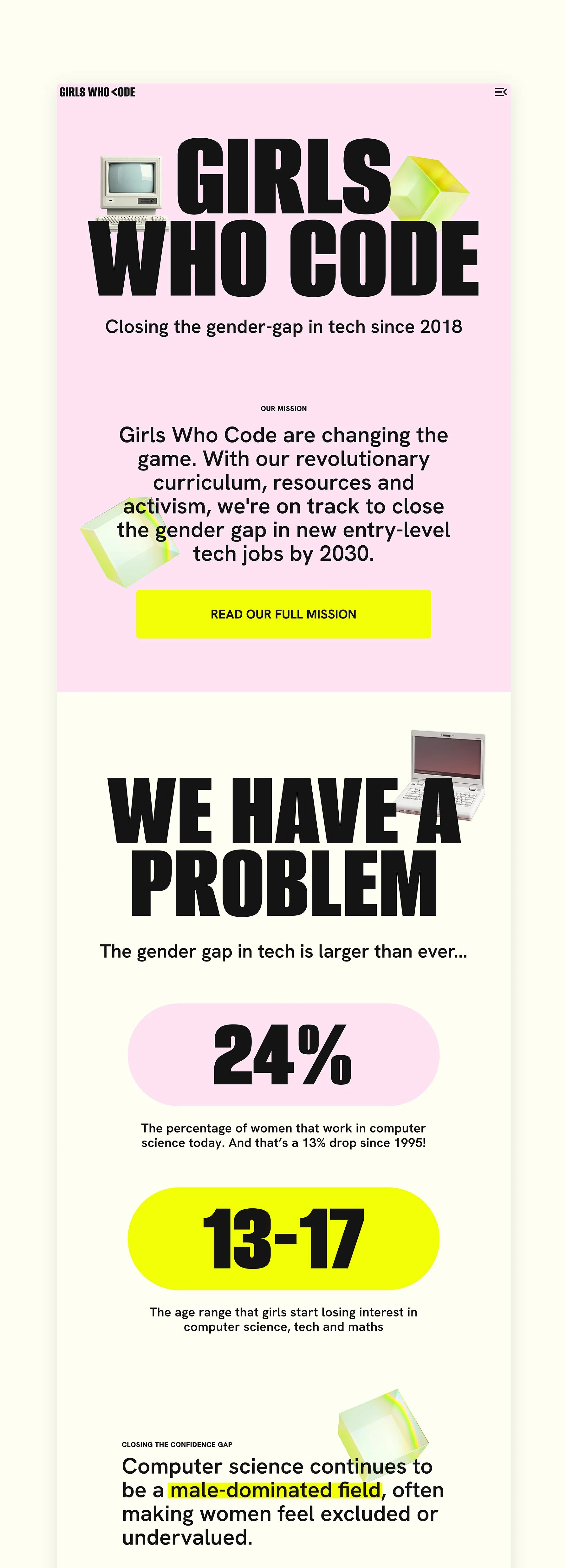
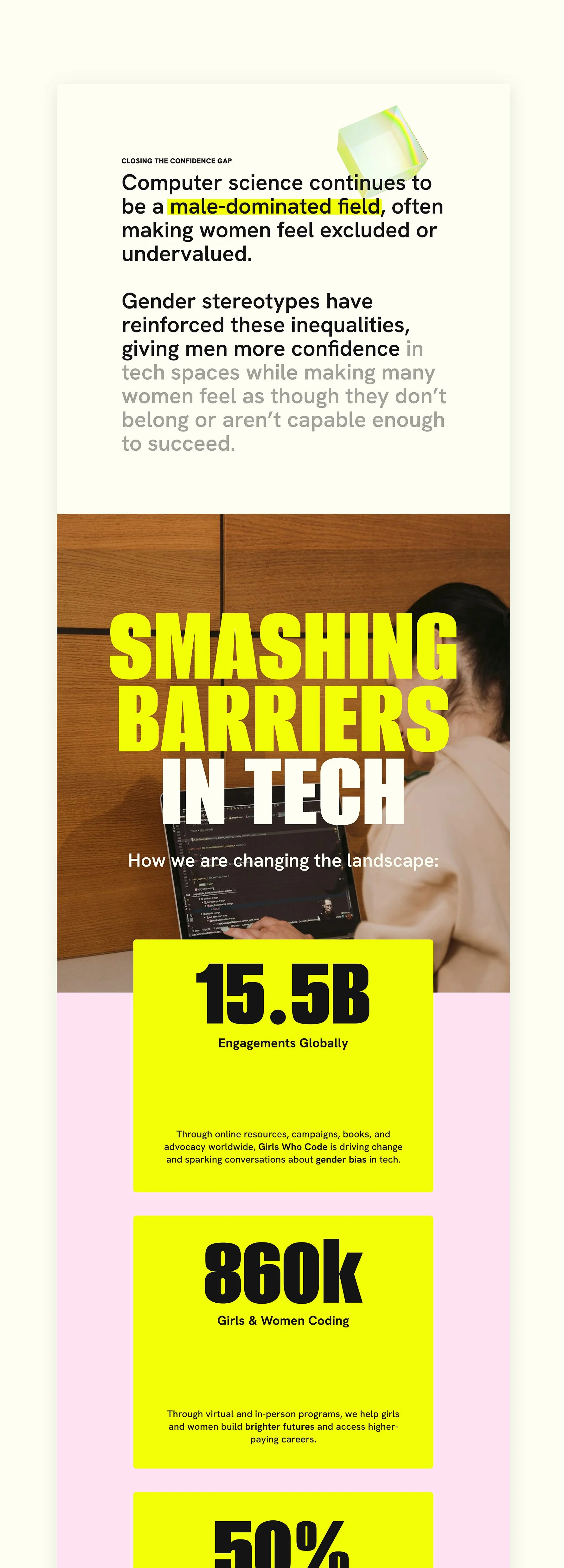
The homepage was designed to guide users naturally through the organisation's story.
Strong visual hierarchy, engaging imagery, and impactful statistics help maintain interest while encouraging users to continue scrolling.
Key sections were carefully structured to answer common user questions:
Why does this organisation matter?
What impact is it making?
How can I get involved?
Large calls-to-action, concise content blocks, and accessible layouts reduce friction and encourage engagement.
The result is a homepage that functions as both an awareness campaign and a conversion tool.
Navigation & Information Architecture
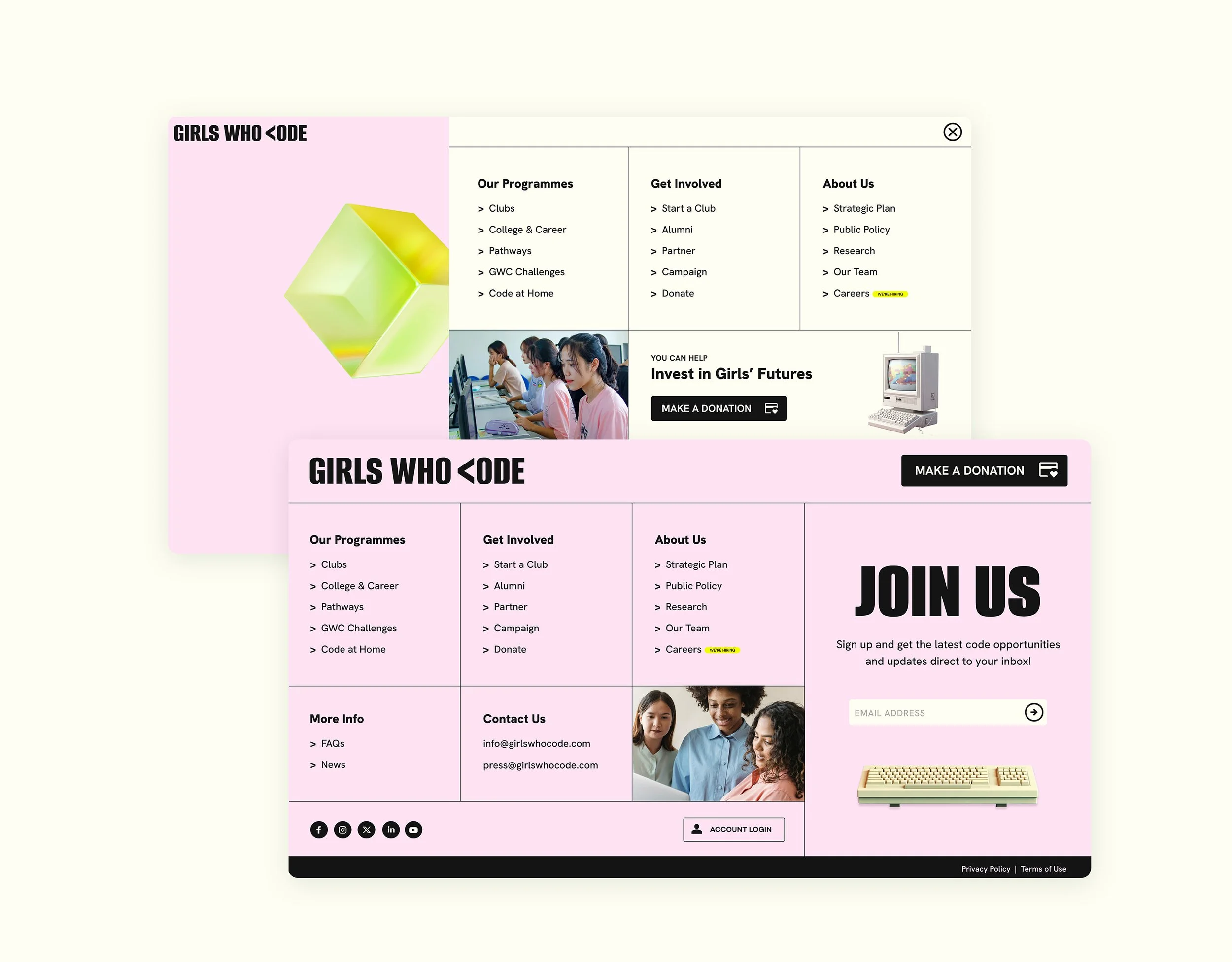
The navigation system was designed to support multiple user types.
The mega-menu structure allows visitors to quickly access:
Programmes
Ways to get involved
Educational resources
Organisational information
This reduces cognitive load and helps users identify the most relevant pathway based on their goals.
Donation opportunities were integrated directly into the navigation to increase visibility and improve conversion opportunities.
Responsive Design
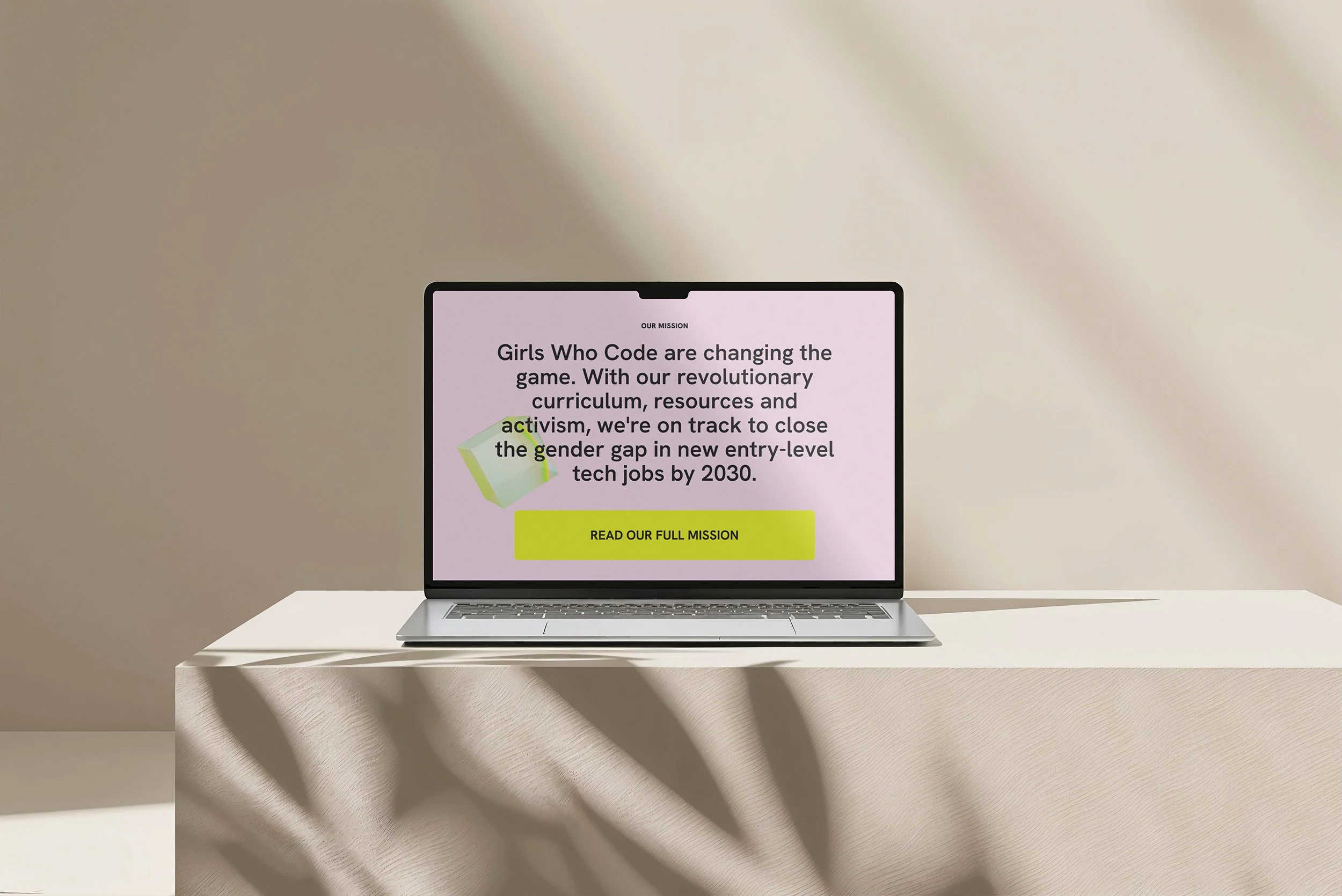
With a large percentage of users accessing websites through mobile devices, responsiveness was a key consideration throughout the design process.
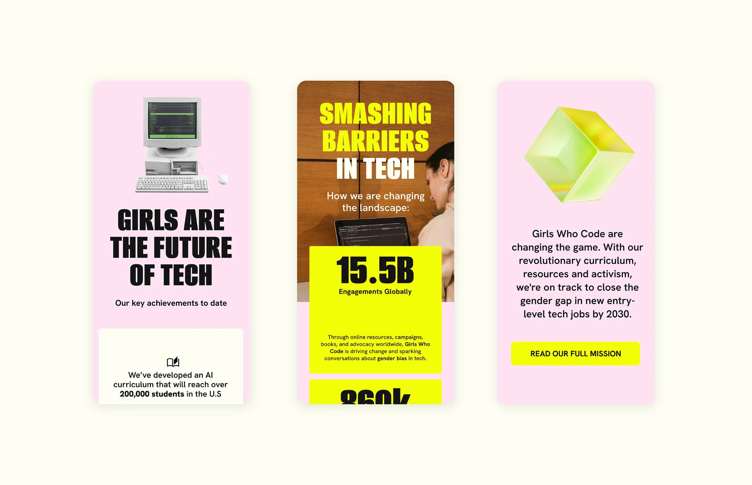
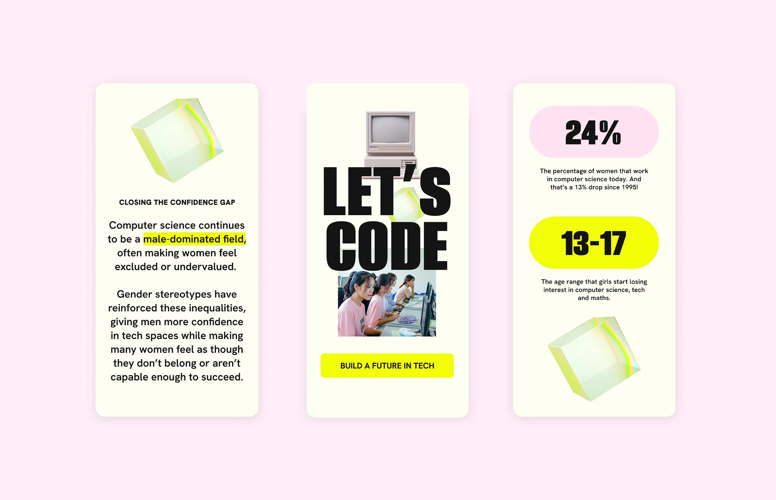
The mobile experience was redesigned to preserve the visual identity while improving usability on smaller screens.
Typography scales appropriately, navigation is simplified, and content is prioritised to ensure users can easily access key information and complete important actions regardless of device.
This creates a consistent experience across desktop, tablet, and mobile platforms.
Outcome
This project transformed Girls Who Code's digital presence into a bold, modern, and conversion-focused experience.
By combining a refreshed visual identity with strategic UX design, the website educates users about the gender gap in technology while encouraging meaningful action.
The final design positions Girls Who Code as both an educational organisation and a powerful movement for change, creating a platform that inspires, informs, and empowers the next generation of women in technology.