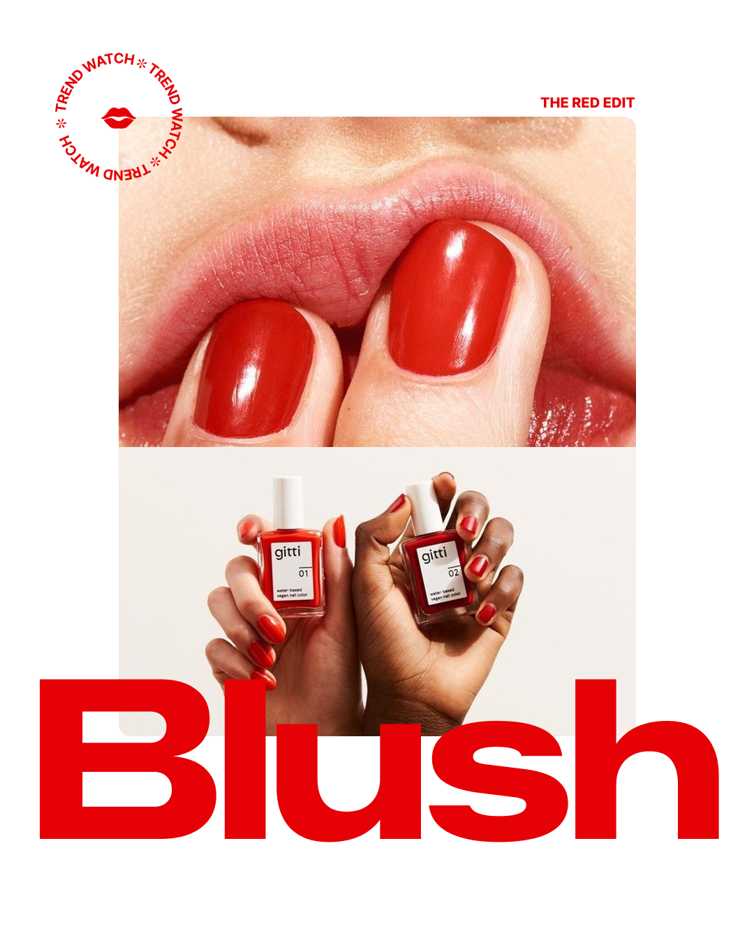
BRANDING | DESIGN | ART DIRECTIONBLUSH BEAUTY
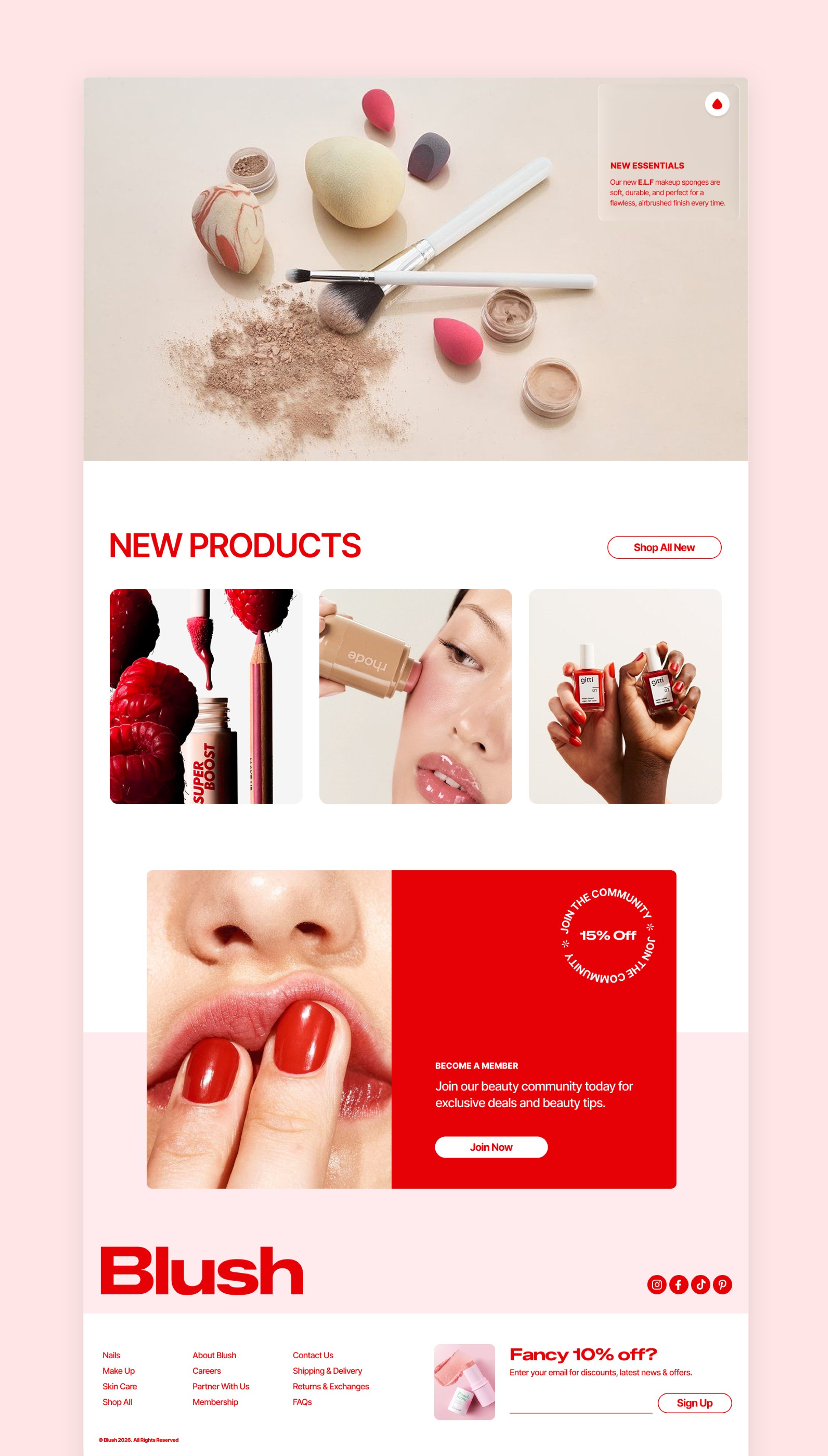
Blush Beauty is a cosmetics brand focused on bold, expressive products and visually driven campaigns. The objective of this project was to develop a cohesive brand identity and digital campaign system that captures attention, communicates product value, and drives engagement across web and social platforms.
Liaising closely with the director, the objective was to create a clean, bold, on-trend brand to impress investors and result in capital to grow the business.
Beauty brands operate in a highly saturated and visually competitive market, making it difficult to stand out while maintaining clarity and consistency across channels.
Key challenges included:
Creating a distinctive visual identity that differentiates the brand
Maintaining consistency across web, social, and campaign assets
Presenting multiple products in a clear and engaging way
Encouraging users to move from discovery to product exploration
My aim was to develop a brand and campaign system that:
Captures attention in competitive digital environments
Communicates product value quickly and clearly
Supports product discovery across multiple touchpoints
Encourages engagement and interaction with the brand
The User
The target audience includes:
Beauty consumers exploring new products and trends
Social-first users influenced by visual content
Customers browsing collections before making purchase decisions
User needs:
Visually engaging, scroll-stopping content
Clear presentation of products and benefits
Easy pathways to explore and interact with the brand
A consistent and recognisable visual identity
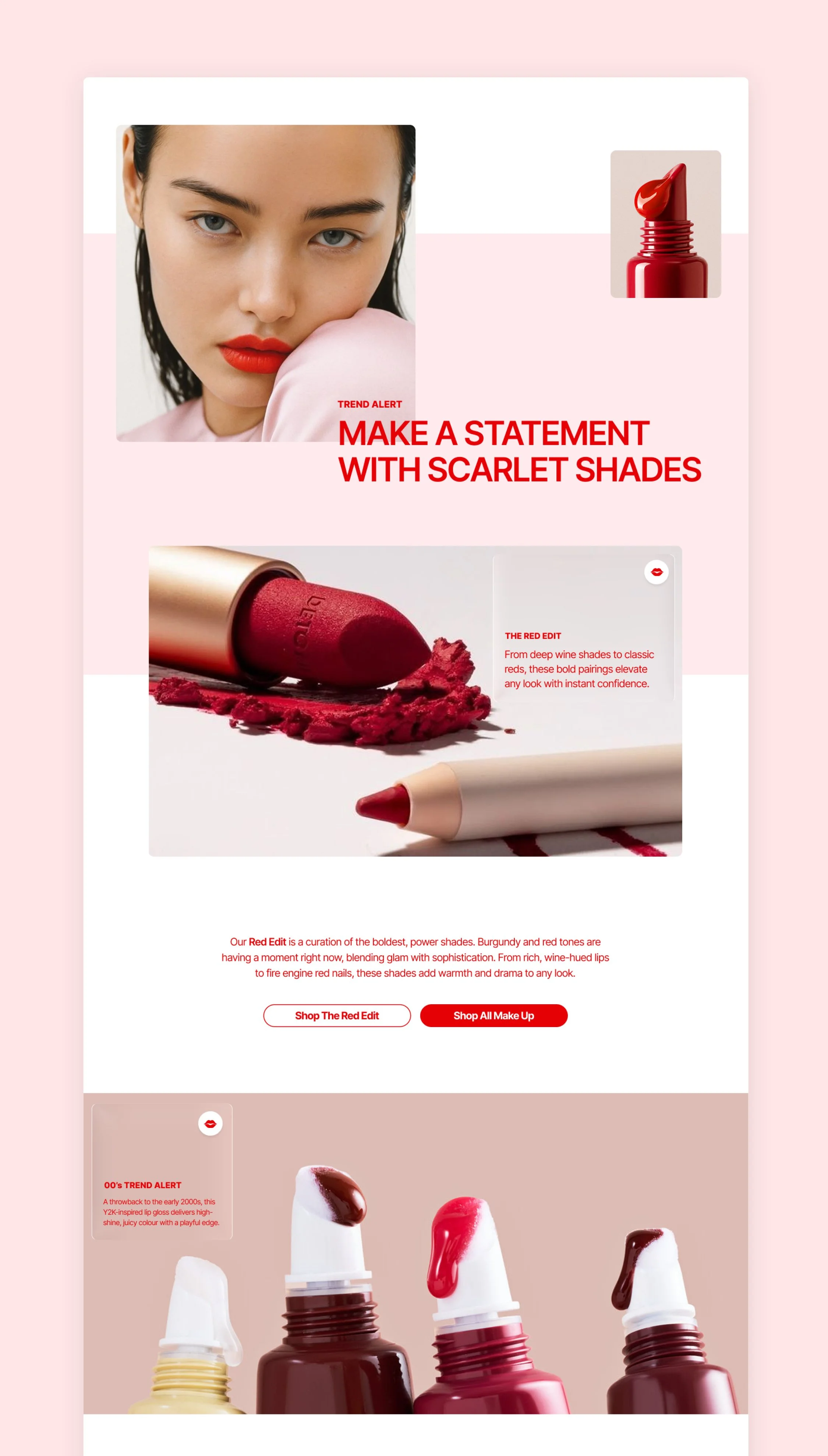
Strategy & Approach
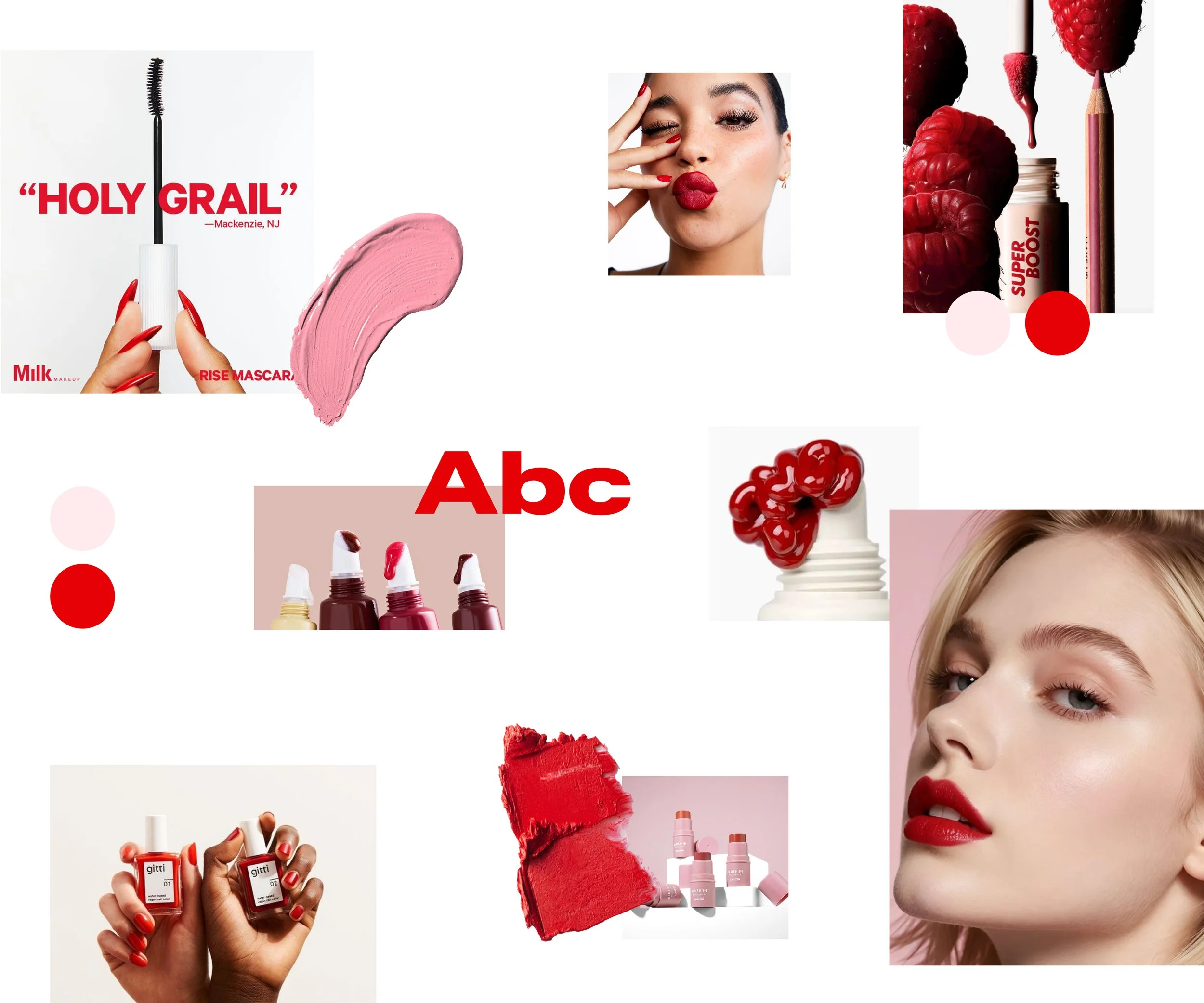
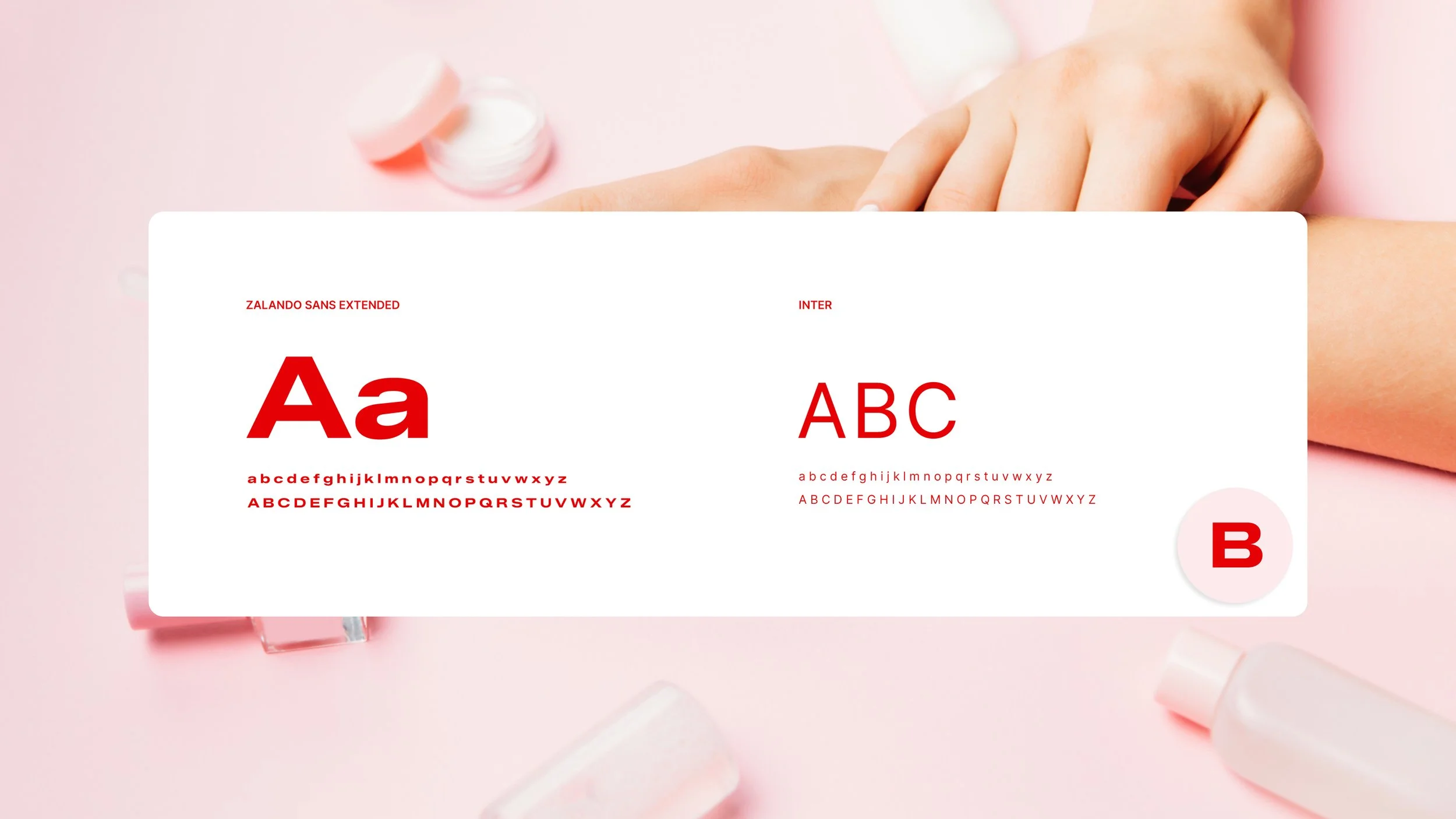
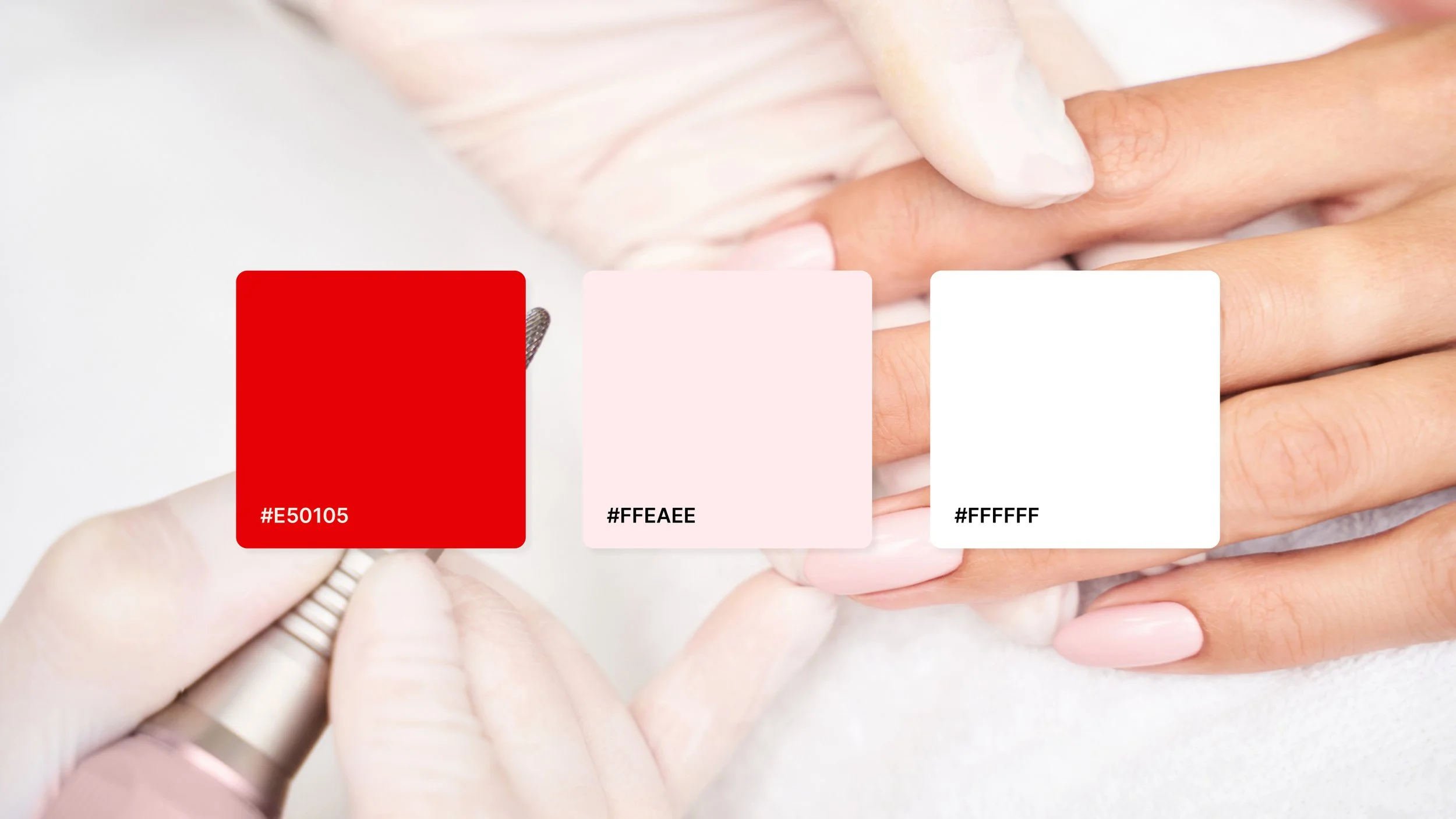
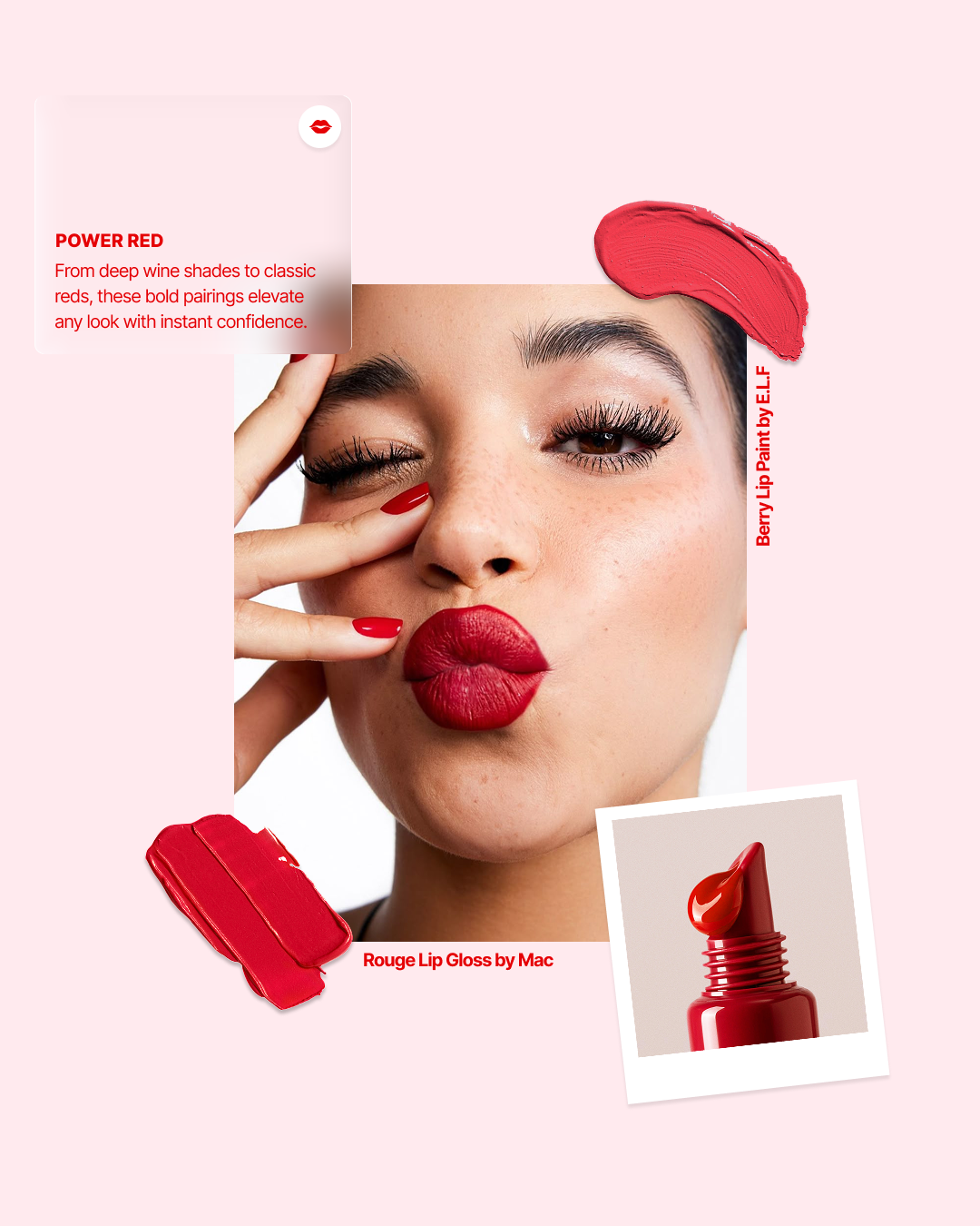
1. Bold, Distinctive Visual Identity
A strong visual system was developed to ensure immediate recognition and impact:
High-contrast colour palette to stand out in crowded feeds
Bold typography to communicate messaging quickly
Clean layouts to balance expressive visuals with clarity
This creates a memorable and scalable brand foundation.
2. Campaign-Led Content System
Rather than isolated designs, the project focused on building a flexible campaign system:
Reusable layouts for product features and collections
Consistent visual language across all assets
Structured compositions to support both storytelling and product visibility
This enables efficient scaling across multiple touchpoints.
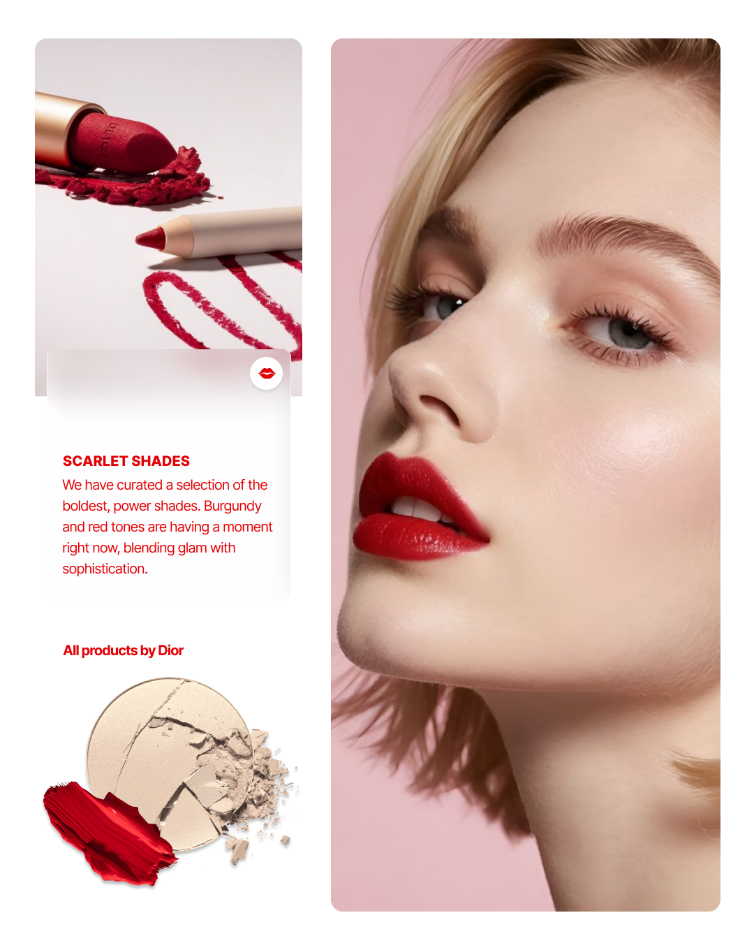
3. Product Discovery Through Visual Hierarchy
Design decisions were made to highlight products effectively:
Image-led layouts to showcase textures, colours, and finishes
Clear hierarchy to prioritise key products and messages
Supporting content to reinforce product benefits
This helps users quickly understand what is being offered and why it’s relevant.
4. Conversion-Focused Digital Touchpoints
Assets were designed to guide users toward action:
Clear calls-to-action integrated within layouts
Messaging designed to encourage exploration and engagement
Consistent interaction patterns across web and social
This ensures users can easily move from inspiration to interaction.
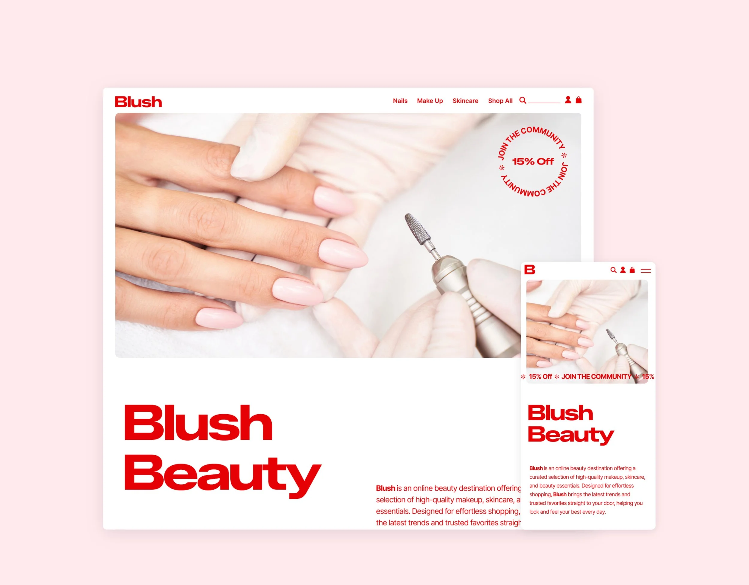
5. Multi-Channel Consistency
The design system was applied across web, social, and mobile formats:
Consistent use of typography, colour, and layout
Adaptable components for different screen sizes and platforms
Cohesive experience across all user touchpoints
This reinforces brand recognition and improves user familiarity.
6. Responsive and Scalable Design
All assets were designed with flexibility in mind:
Mobile-first considerations for social and web usage
Scalable layouts to support future campaigns
Efficient design patterns to maintain consistency over time
This supports long-term usability and brand growth.
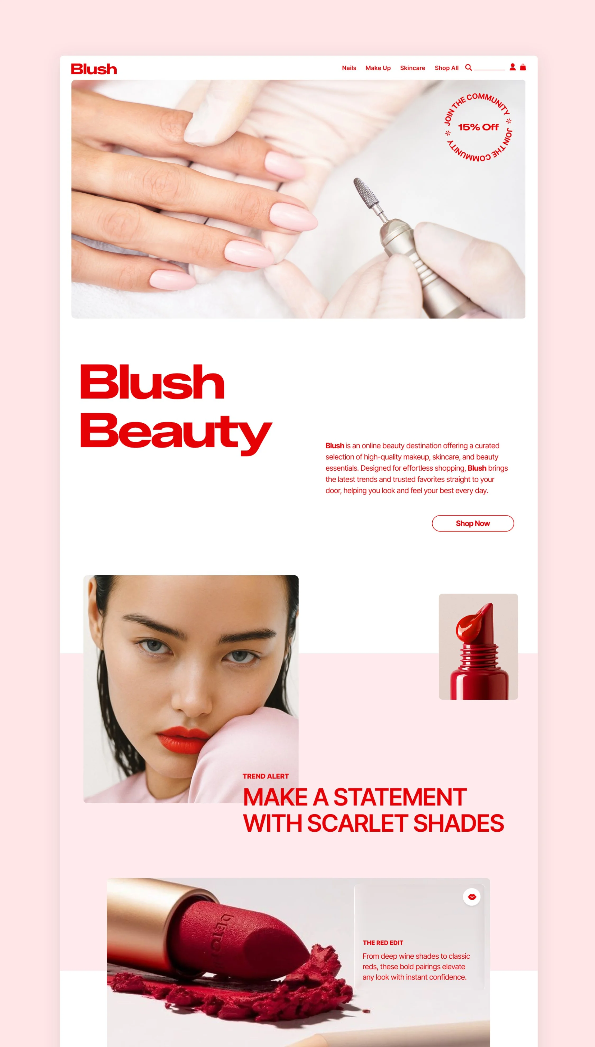
The Outcome
The final brand and campaign system delivers a cohesive, high-impact experience that:
Differentiates the brand through bold and recognisable design
Supports product discovery with clear and structured layouts
Encourages engagement across multiple digital channels
Provides a scalable foundation for future campaigns