BRANDING | WEB DESIGN | CSSPINK
Pink is a modern accounting and tax consultancy specialising in supporting businesses and limited companies. The objective of this project was to design a high-performing marketing website that simplifies complex financial services, builds trust, and drives inbound enquiries.
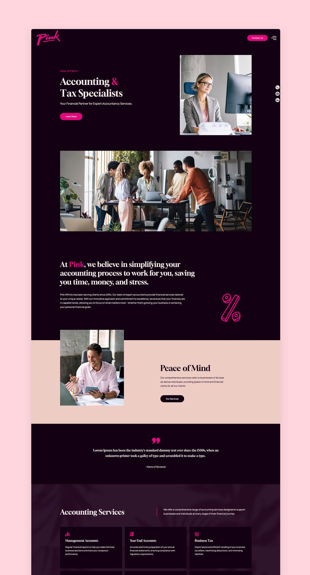
I created a new colour palette that focused on highlighting the bright pink shade, and opted for darker background tones to achieve this. Hand drawn style illustrations were implemented across the site, and work well with the existing logo.

The challenge was to create a website that felt approachable and modern, while clearly communicating expertise and encouraging potential clients to take action.
Key challenges included:
Making complex financial services easy to understand
Differentiating the brand in a competitive, traditional market
Building trust quickly with business-focused users
Structuring content to guide users from landing to enquiry
My task was to design a conversion-focused website that:
Clearly communicates services and value propositions
Builds credibility with business owners and decision-makers
Encourages users to enquire or request services
Delivers a seamless and engaging experience across devices


The User
The primary audience includes:
Small to mid-sized business owners
Founders and decision-makers seeking reliable financial support
Companies looking for long-term accounting partnerships
User needs:
Clear understanding of services and benefits
Confidence in expertise and professionalism
Easy access to contact or enquiry options
Efficient navigation without unnecessary complexity

Strategy & Approach
1. Strong Value Proposition in the Hero Section
The hero (“Accounting & Tax Specialists”) is designed to immediately communicate expertise and relevance.
Clear, benefit-led messaging targeting business users
Professional imagery to reinforce trust and credibility
Prominent call-to-action to encourage early engagement
This ensures users can quickly determine if the service meets their needs.
2. Simplifying Complex Services Through Structure
Financial services were broken down into clear, digestible sections:
Service categories presented with concise explanations
Visual hierarchy used to prioritise key information
Supporting content to provide clarity without overwhelming the user
This approach improves accessibility and helps users quickly find relevant services.
3. Conversion-Focused User Journey
The website is structured to guide users through a clear decision-making flow:
Credibility & positioning (hero + introduction)
Service understanding (what’s offered and who it’s for)
Trust-building (case examples, benefits, supporting content)
Action (enquiry / contact prompts)
Calls-to-action are placed at key points throughout the journey to reduce friction and encourage conversion.

4. Distinctive Visual Identity for Differentiation
A bold visual system was developed to stand out in a traditionally conservative industry.
Dark background with high-contrast accents to create impact
Vibrant colour highlights to draw attention to key actions
Consistent UI components to maintain cohesion across pages
This helps position the brand as modern, confident, and forward-thinking.
5. Layout Decisions to Support Scannability
The layout prioritises clarity and usability:
Modular sections allow users to quickly scan and navigate
Balanced use of imagery and text maintains engagement
Clear spacing and hierarchy guide user attention
These decisions reduce cognitive load and support faster decision-making.
6. Responsive Design for Business Users on the Go
The experience was optimised across devices, particularly mobile:
Simplified navigation for quick access to services
Prioritised key messaging and CTAs on smaller screens
Maintained visual consistency across breakpoints
This ensures users can easily explore services and make enquiries from any device.

The Outcome
The final website delivers a clear, modern, and conversion-focused experience that:
Simplifies complex financial services into accessible content
Builds trust through strong visual and structural design
Guides users through a logical journey from discovery to enquiry
Encourages action through well-placed calls-to-action