CSS | WEB DESIGN | ART DIRECTIONCLUB SODA
Club Soda is a social platform designed to help people form real-world connections through shared experiences. The goal of this project was to design a marketing website that clearly communicates the value of the platform while guiding users from discovery to sign-up.
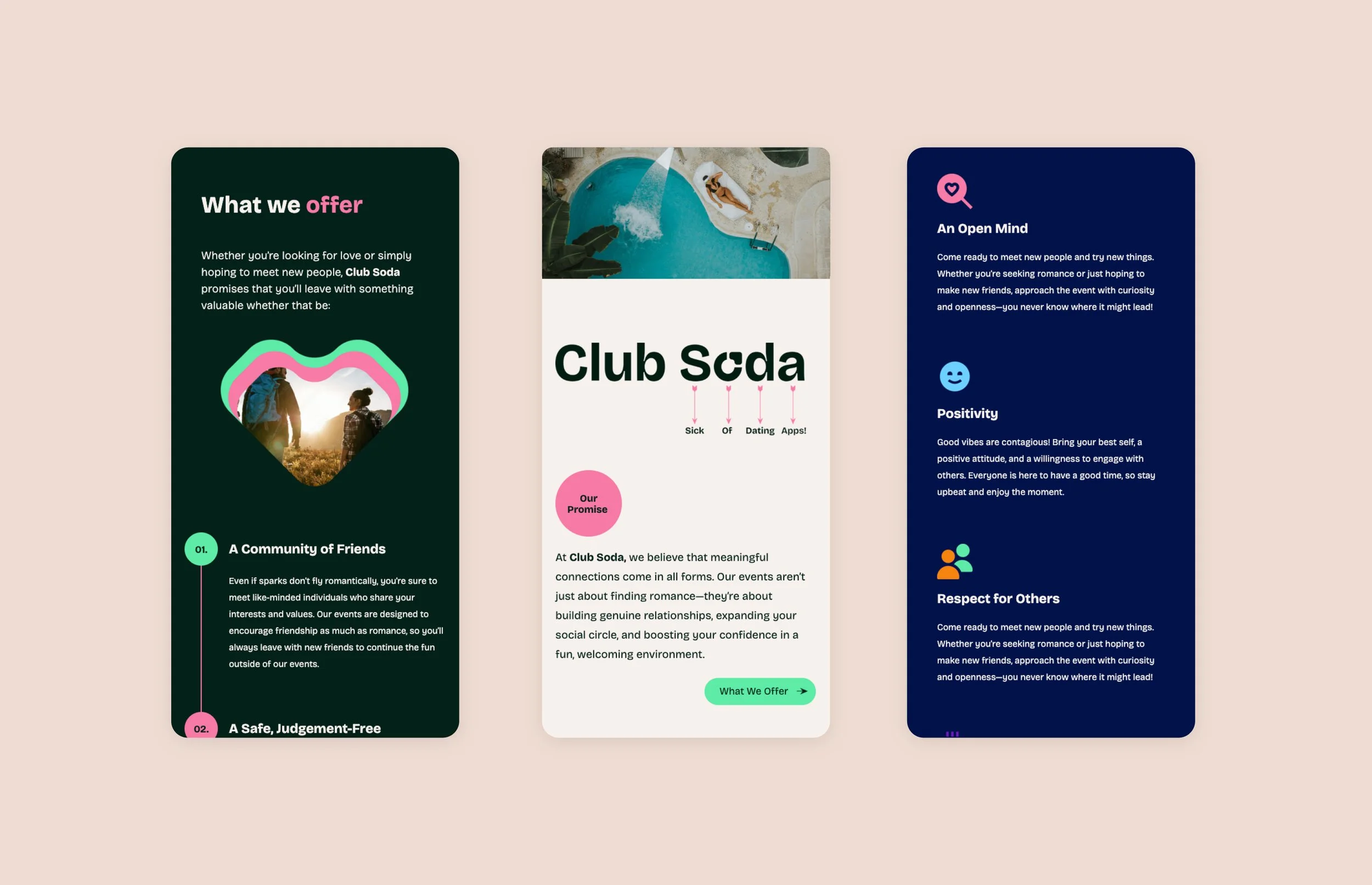
The business have a bold and playful brand style, and their aim was to have a website that reflected their approachable and friendly tone of voice - encouraging users to sign up to events.
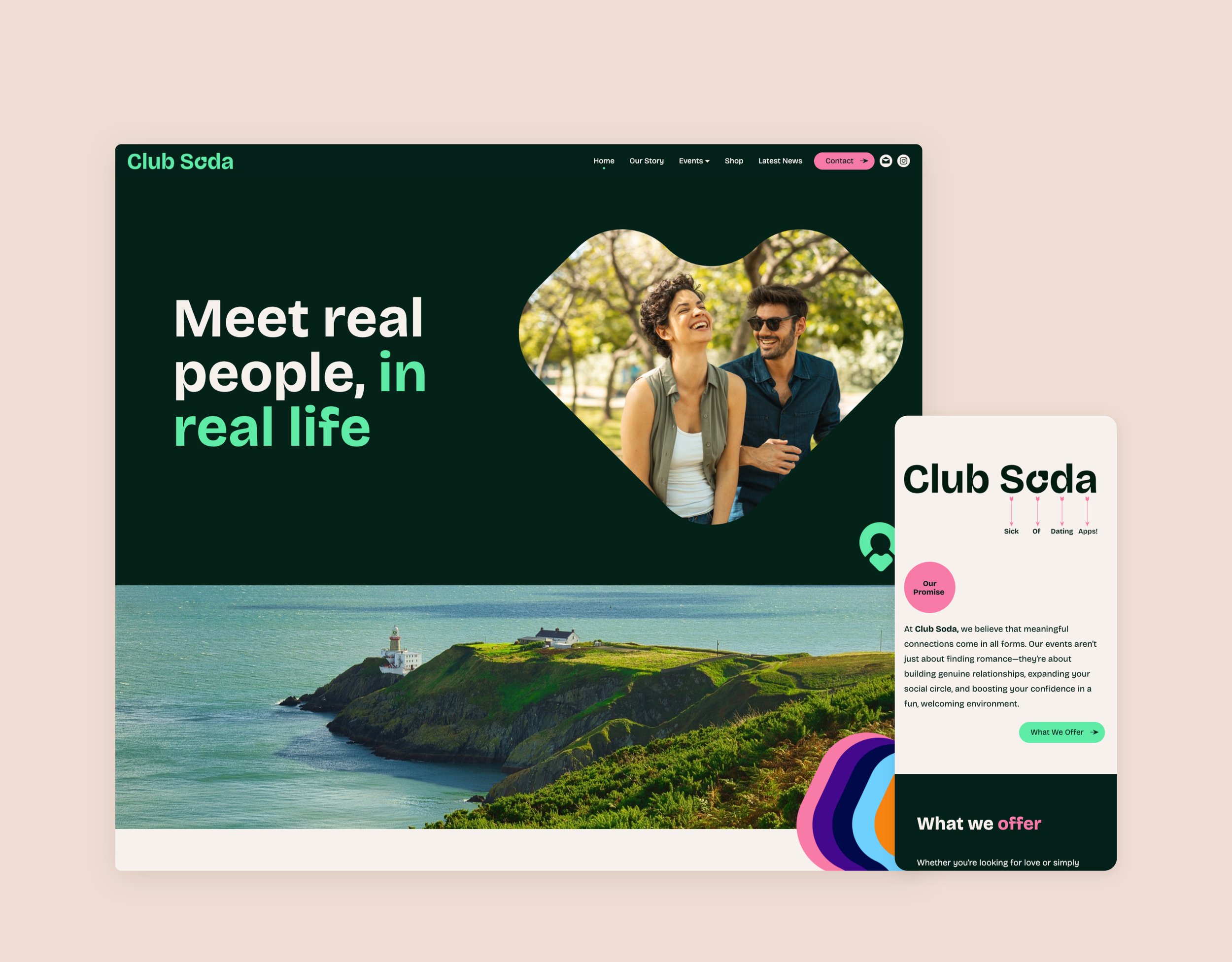
I led the end-to-end design process, implementing a dark backdrop, a vibrant rainbow colour palette, striking graphics, bold typography, and heart-shaped motifs to create a visually compelling and cohesive design.
The core challenge was translating an emotionally-driven product (“meet real people in real life”) into a clear and compelling digital experience.
Key issues to solve:
Users needed to quickly understand how the platform works
The value proposition had to stand out in a crowded social/dating space
The website needed to balance emotional appeal with functional clarity
The journey from landing → engagement → action needed to feel intuitive and frictionless
The User
The primary audience includes:
Socially motivated individuals looking for real-world connections
Users fatigued by traditional dating apps
People seeking low-pressure, community-driven experiences
These users value:
Authenticity over polish
Clarity over complexity
Fast understanding of “what’s in it for me”

Strategy & Approach
1. Clear Value Proposition Above the Fold
The hero section (“Meet real people, in real life”) was designed to immediately communicate the platform’s purpose.
Direct, benefit-led messaging
Human imagery to reinforce authenticity
Minimal friction to help users quickly orient themselves
This ensures users understand the offering within the first few seconds of landing.
2. Structured Content for Progressive Disclosure
The page is designed to guide users through a logical journey:
Emotional hook → Why this matters
Product explanation → How it works
Value breakdown → What users gain
Call to action → What to do next
This structure reduces cognitive load and helps users build confidence as they scroll.
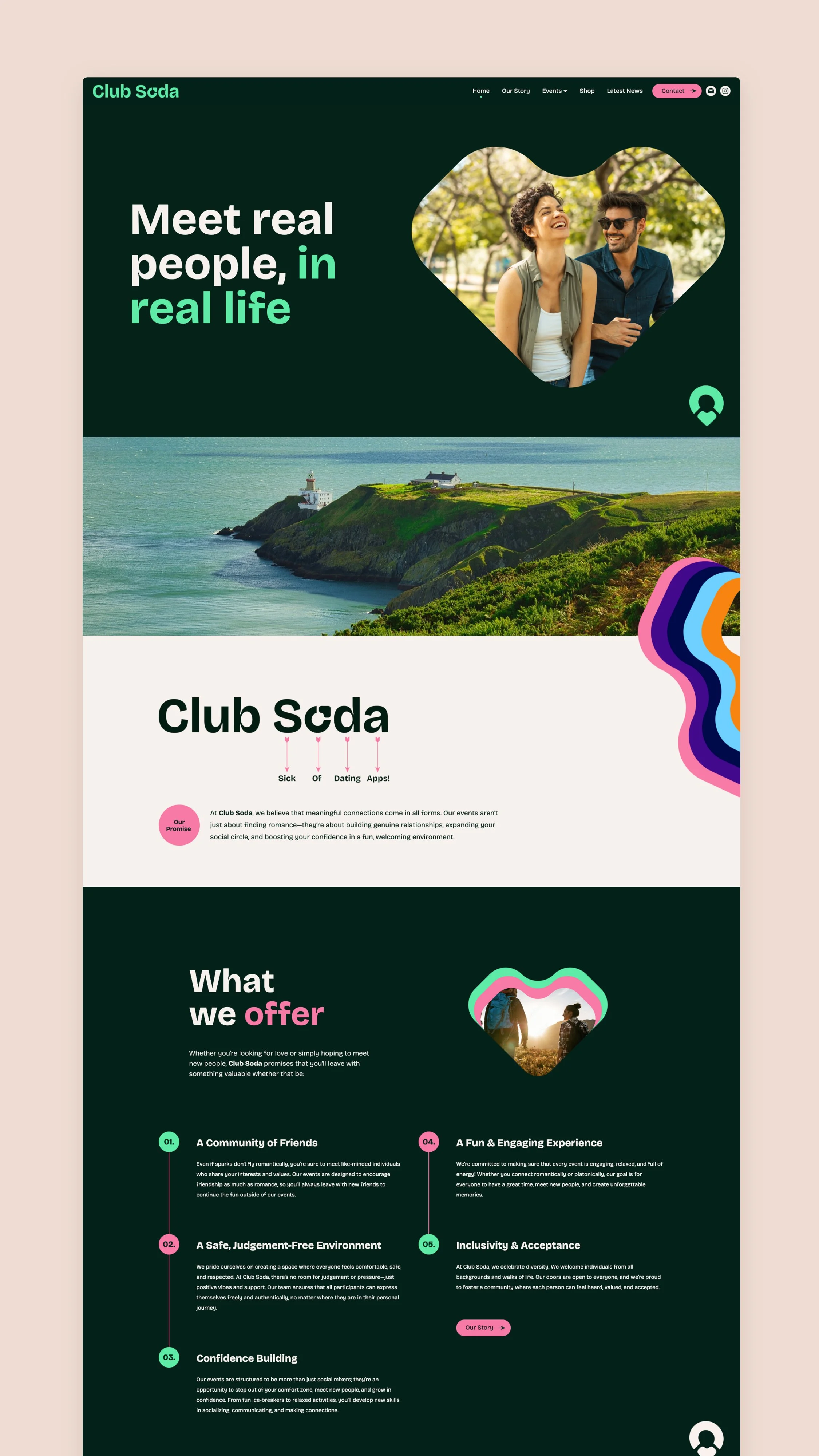
3. Visual System to Reinforce Brand & Navigation
A flexible visual system was developed using organic shapes and bold colour contrasts.
Shapes act as visual anchors, helping users scan content
Colour is used to highlight key actions and important information
Consistent components create familiarity across the page
This supports both brand recognition and usability.
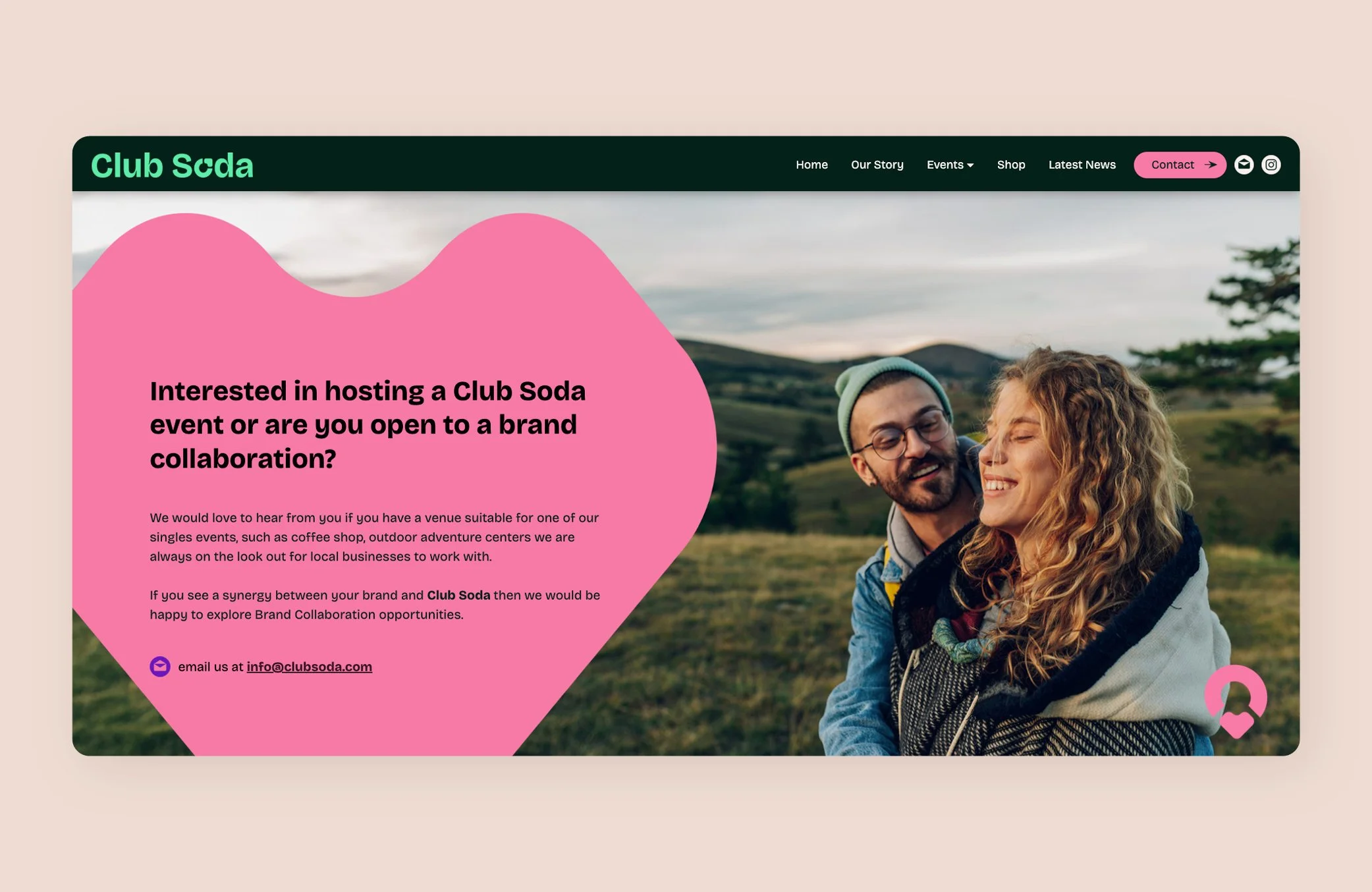
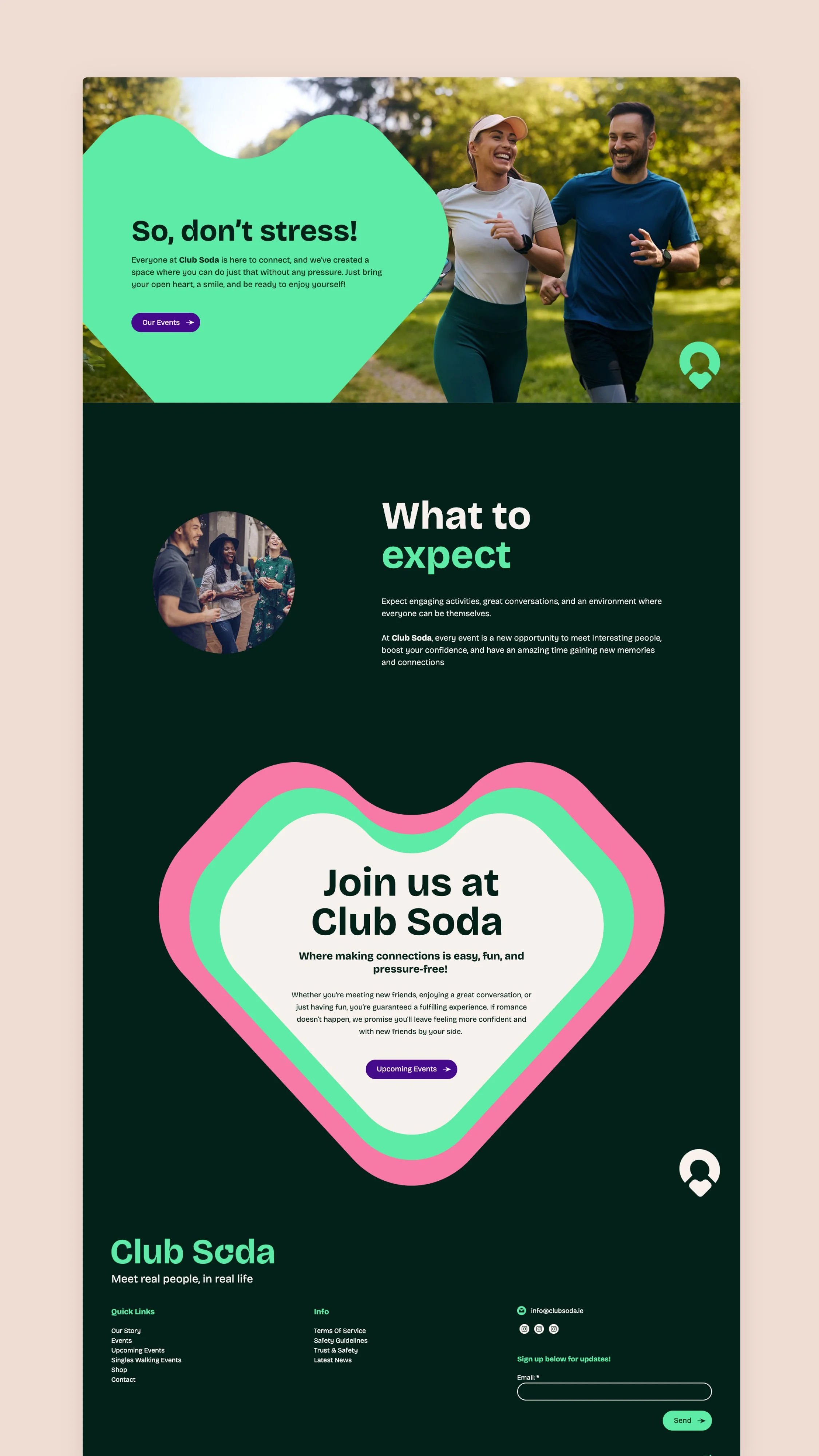
4. Conversion-Oriented Layout Decisions
Each section is designed with user intent in mind:
Clear segmentation of content to avoid overwhelm
Repeated calls-to-action placed at natural decision points
Balanced text-to-visual ratio to maintain engagement
The layout encourages users to move through the page without friction and take action when ready.
5. Responsive Design for Cross-Device Consistency
The experience was optimised across desktop and mobile:
Simplified layouts for smaller screens
Prioritised key messaging and CTAs
Maintained visual hierarchy and readability
This ensures a consistent and effective experience regardless of device.
The Outcome
The final design delivers a clear, engaging, and conversion-focused user journey that:
Communicates the product’s value quickly and effectively
Encourages deeper exploration through structured content
Supports user decision-making with clear pathways and calls-to-action
Balances strong visual identity with usability and performance