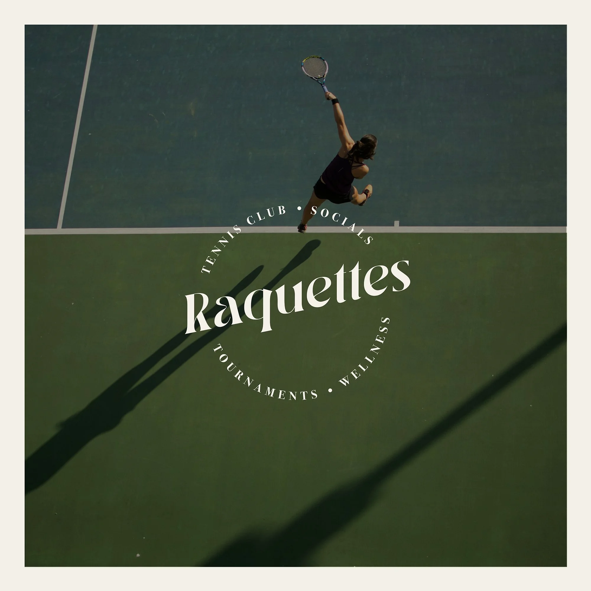
RAQUETTES
Raquettes are a Tennis and Social Club that I founded as part of a personal branding initiative. The club embodies a high-end, elegant aesthetic, combining sophistication with modern sensibilities.
Its style draws inspiration from iconic destinations like the Palm Springs Country Club, yet reimagined with a youthful, fresh perspective that blends luxury, leisure, and social vibrancy. Every detail is carefully curated to reflect both timeless elegance and contemporary lifestyle appeal.
BRANDING | GRAPHIC DESIGN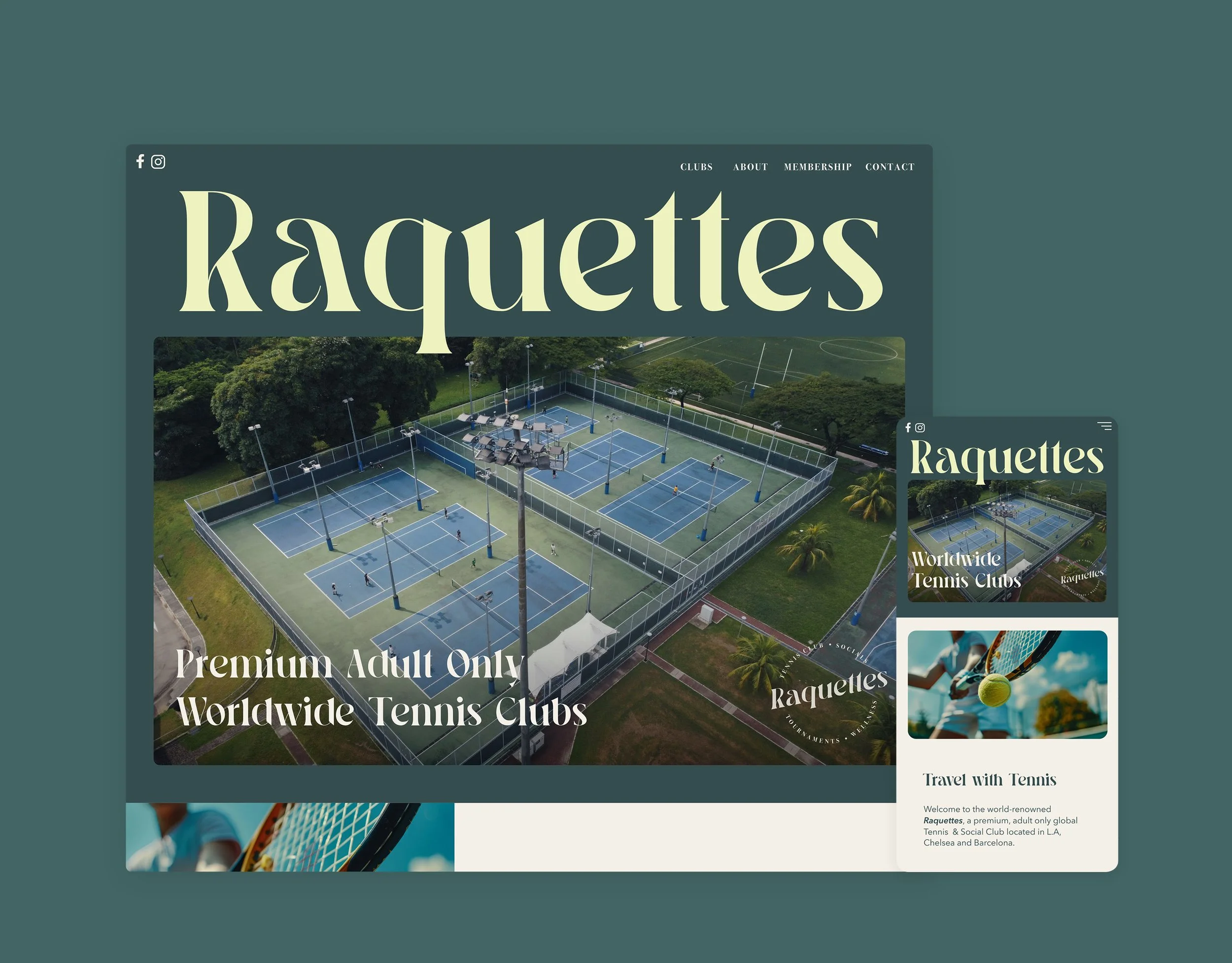
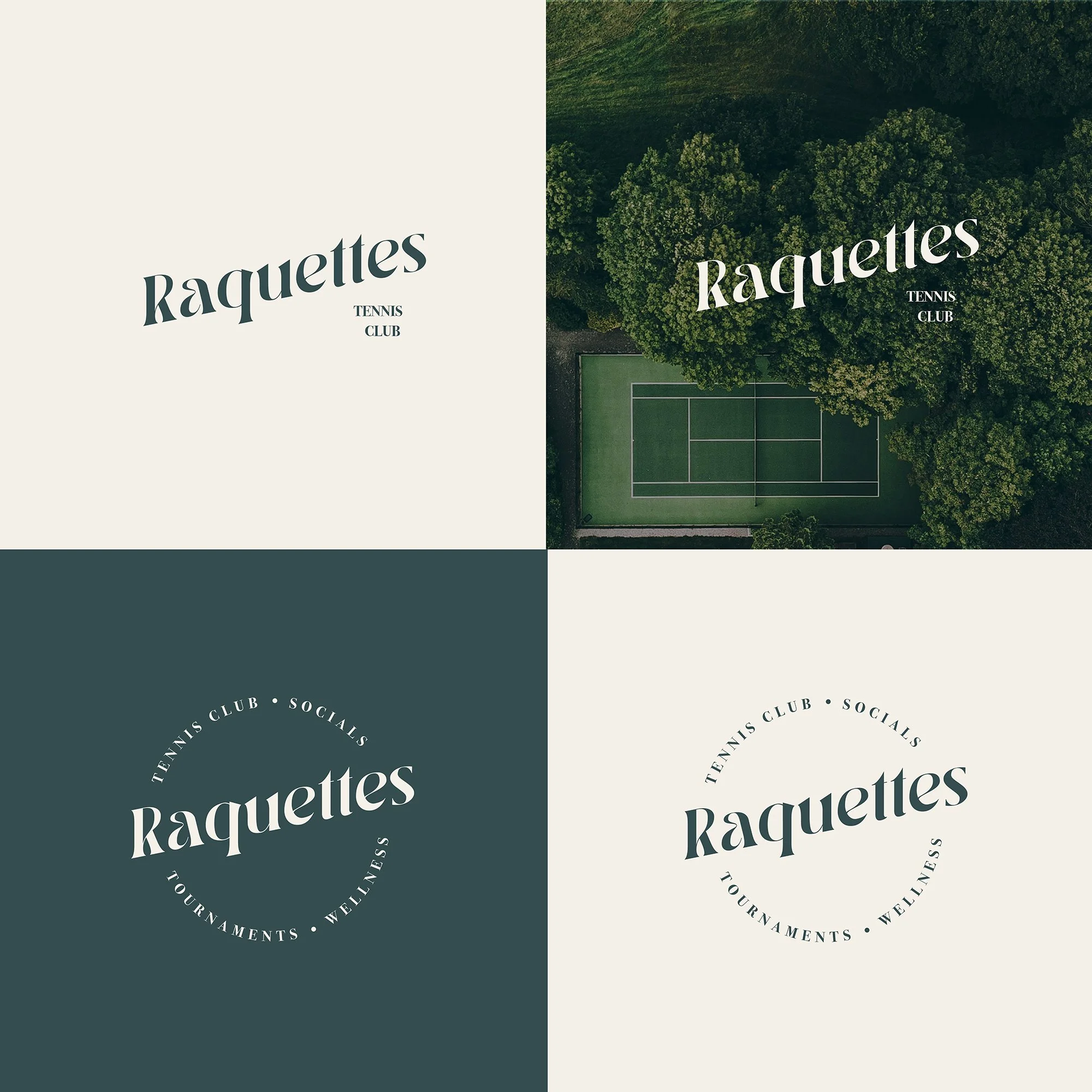
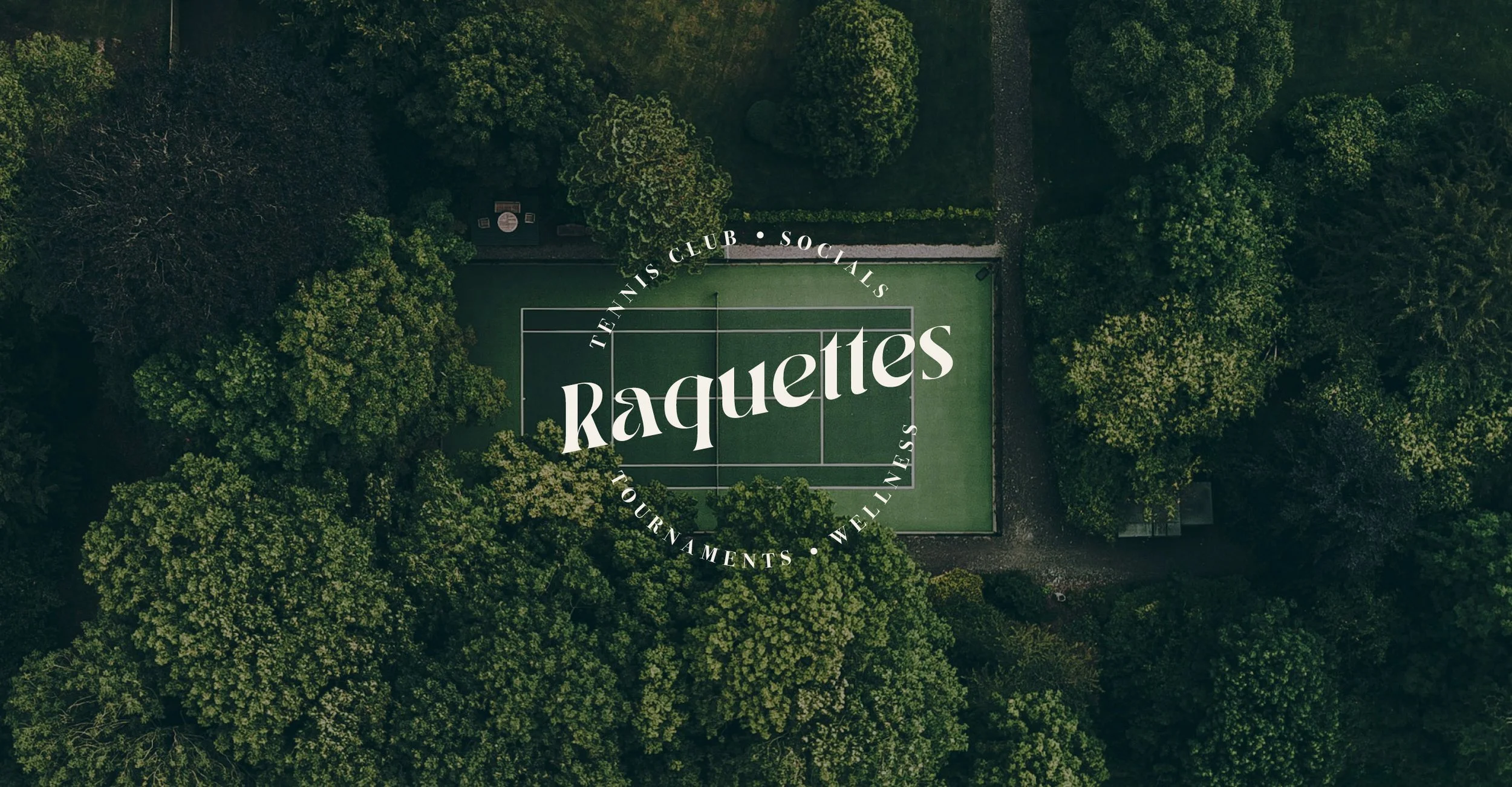
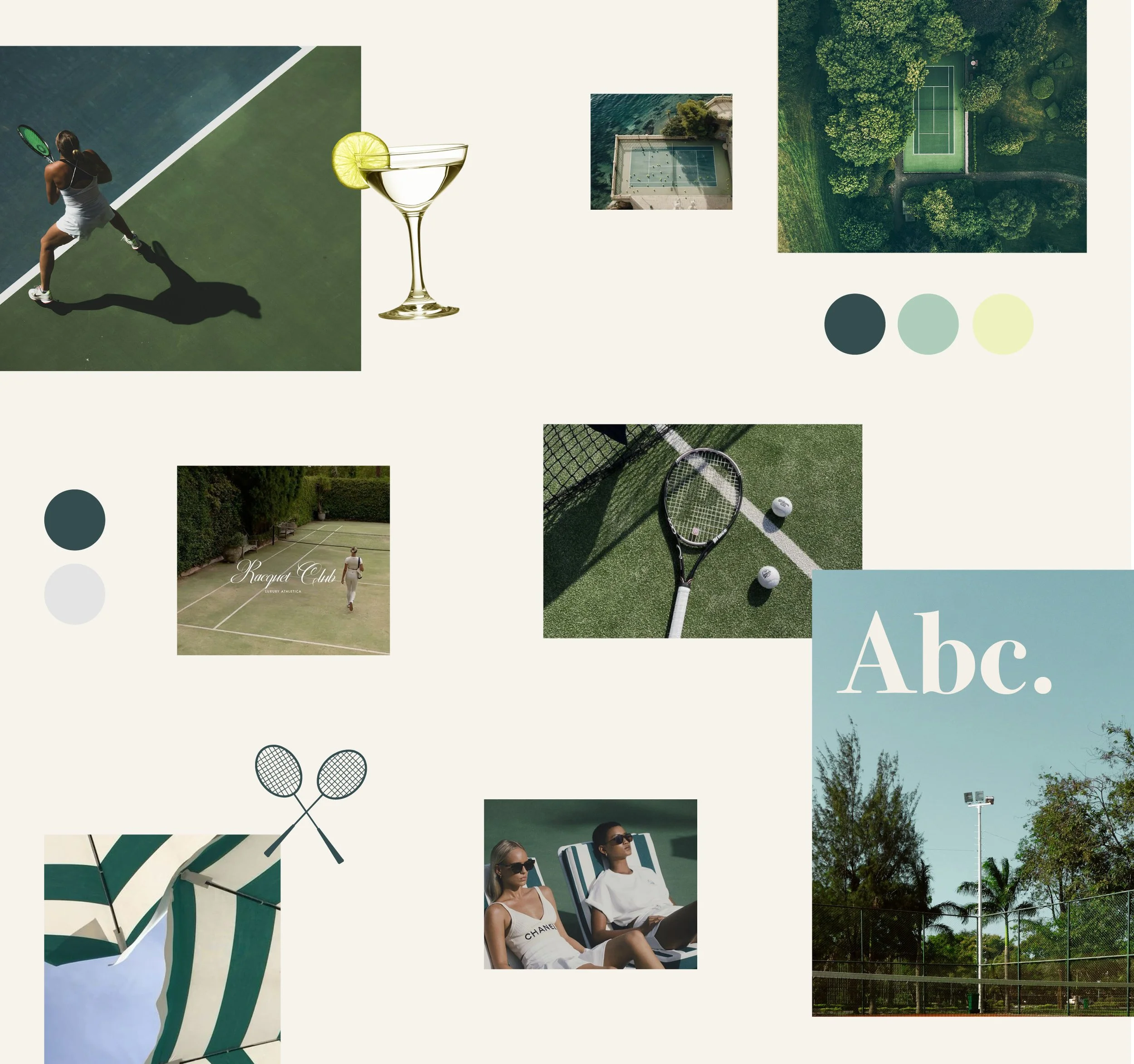
LOGO & MOODBOARD
The logo is crafted within a circular shape and showcases an elegant, ultra-glamorous serif font. To define the brand’s style, a mood board was developed featuring imagery of tennis, travel, leisure, and timeless fashion. The goal is to evoke a sense of glamour, luxury, enjoyment, and prestige.
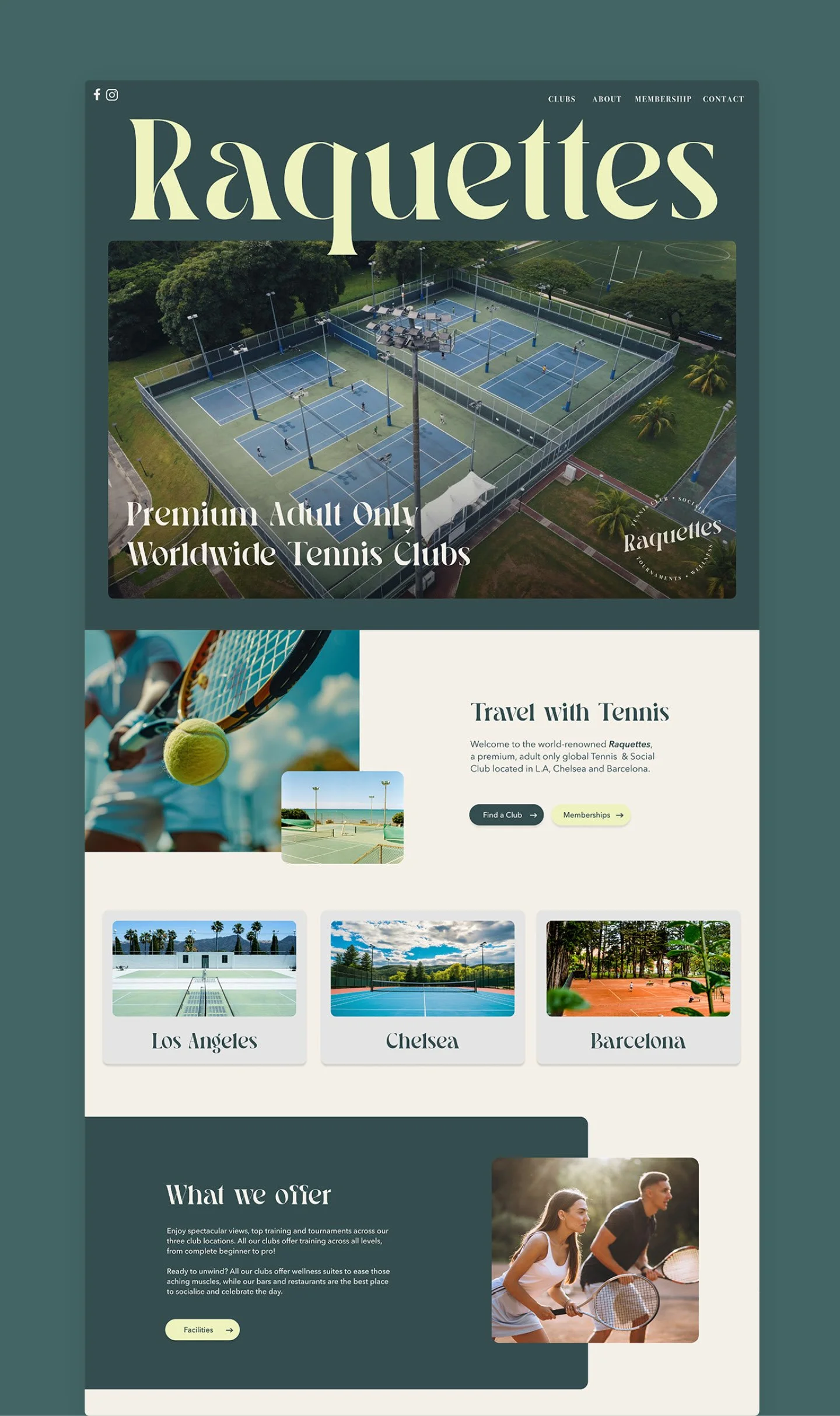
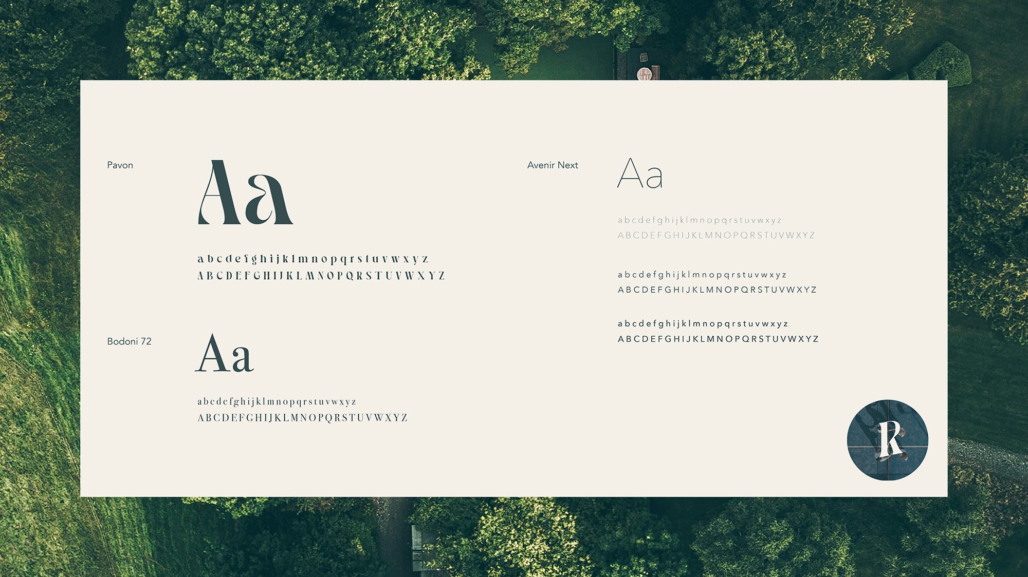
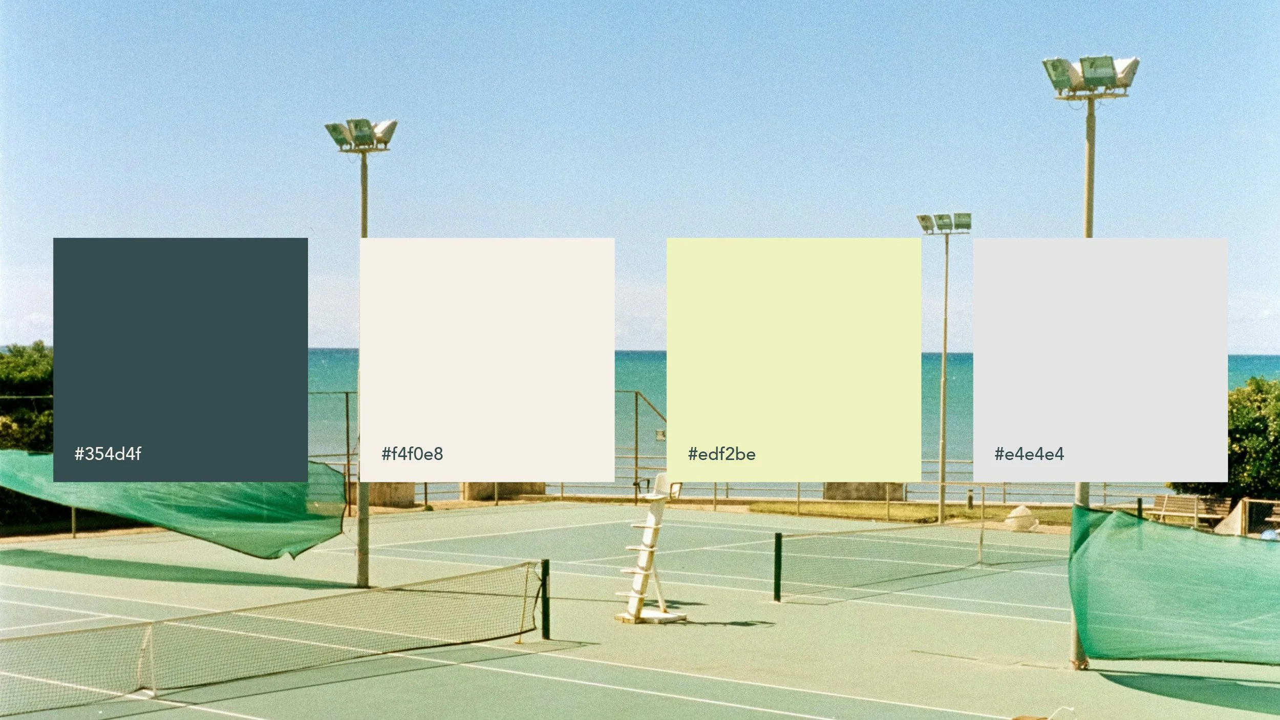
TYPOGRAPHY & PALETTE
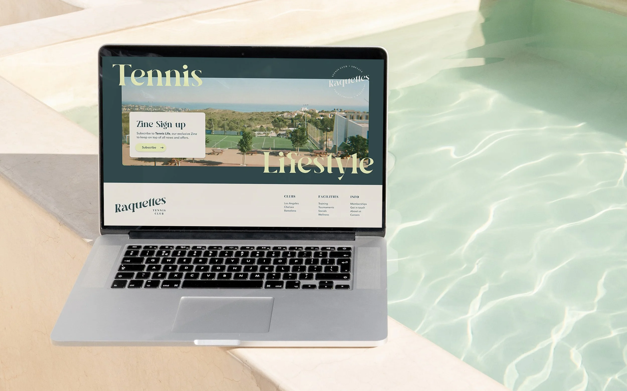
For large headings, I opted for Pavon, which adds glamour and a subtle edge to the brand. Subheadings use Bodoni 72, maintaining a classic, high-end feel, while Avenir Next is applied to all body copy for its elegance and refined weight variations.
The colour palette - comprising shades of teal, grey, green, and blue - is understated and classic, contributing to a sophisticated, “old-money” aesthetic.
BRAND ASSETS
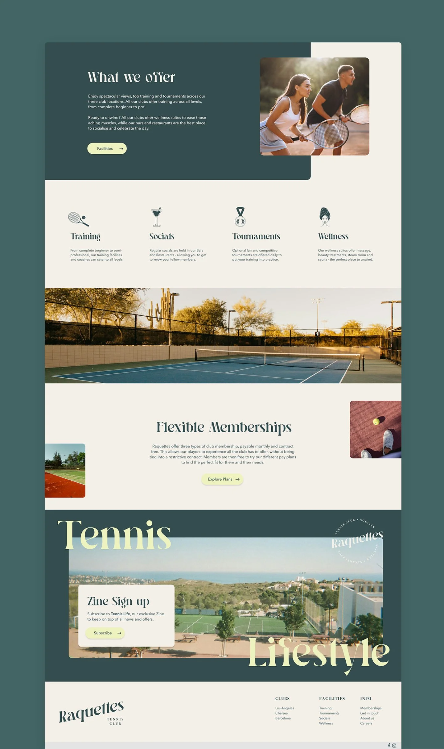
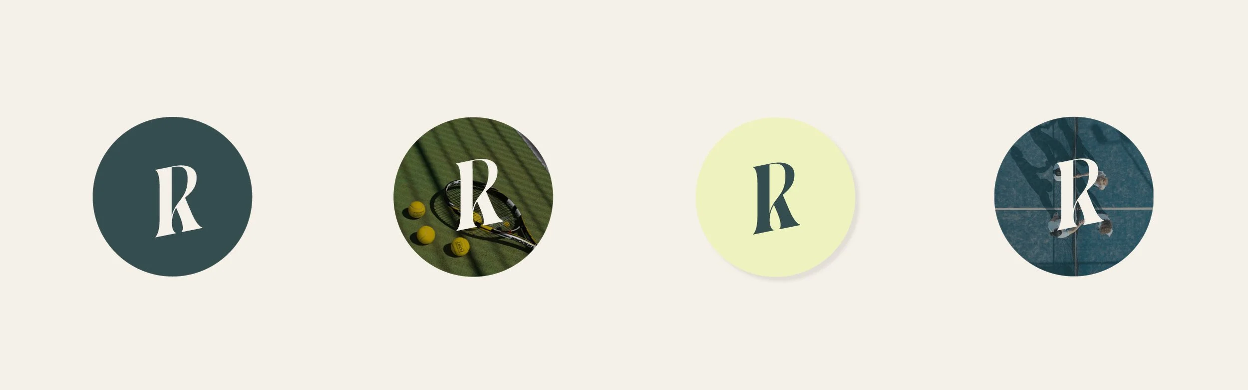
The letter R serves as a distinctive icon and an alternative logo for the brand, offering a clean and recognisable visual representation. It can be presented within a circular frame, either set against a solid colour background or overlaid on an image, providing versatility in its application across different media.
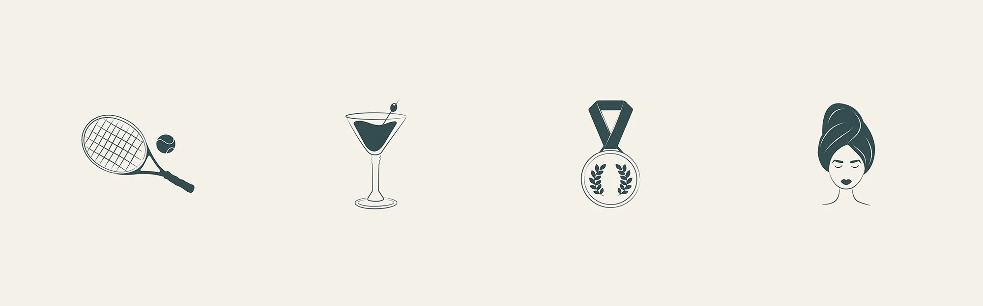
To highlight the key offerings of the club, illustrated icons are employed as visual cues, each carefully designed to reflect a specific aspect of the club experience. These icons represent Coaching, Socials, Tournaments, and Wellbeing, helping to communicate the club’s diverse activities in a clear, engaging, and instantly recognisable way.
Together, the R icon and the accompanying illustrated symbols create a cohesive visual identity that is both modern and approachable, reinforcing the brand’s personality while making information easily digestible for members and visitors alike.